
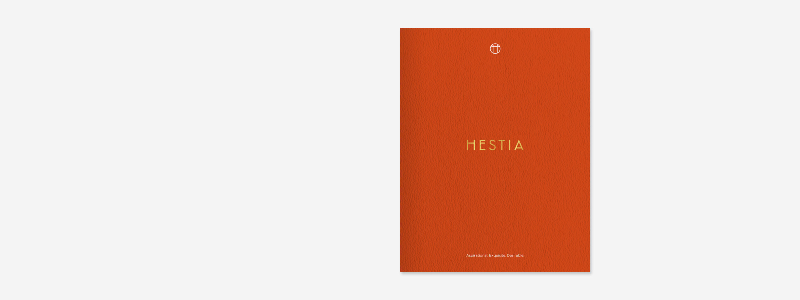
Hestia
How did we help Natalia Barbour, an exclusive London-based interior designer, rename and relaunch her studio?
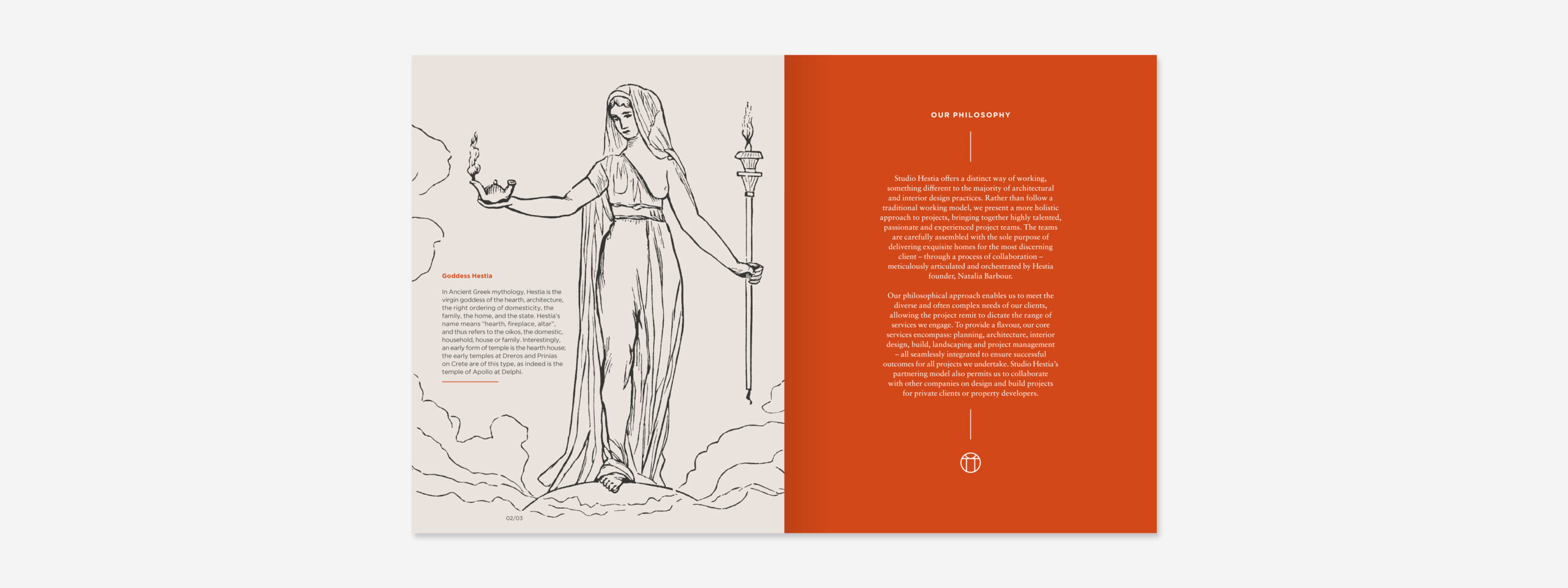
By taking inspiration from ancient Greek mythology; Hestia – the goddess of the hearth, architecture, the right ordering of domesticity, the family and the home.

The Brief
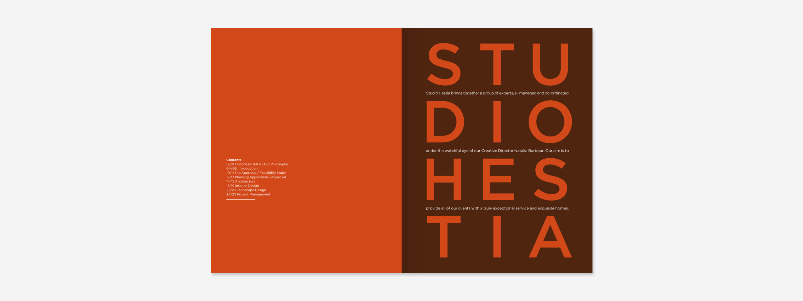
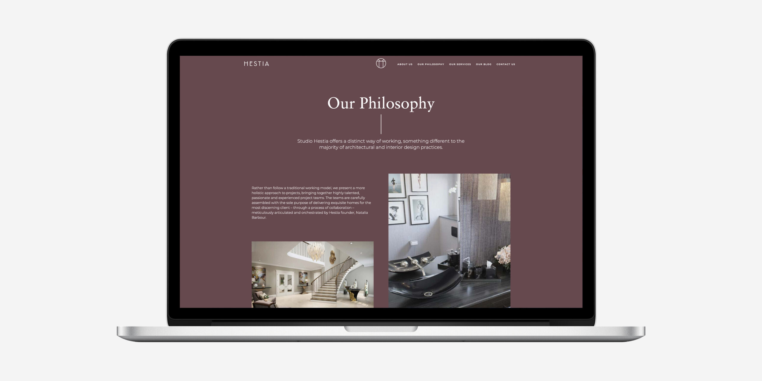
Having run a successful practice for a number of years, Natalia wanted to breathe new life into her design business: renaming, rebranding and relaunching. The restructured practice offers a distinct way of working, something different to the majority of architectural and interior design business. Rather than follow a traditional working model, the carefully selected team present a holistic approach to projects. Our brief was to create a brand that positioned the studio as highly creative, with clearly defined services and offerings.
Our Response
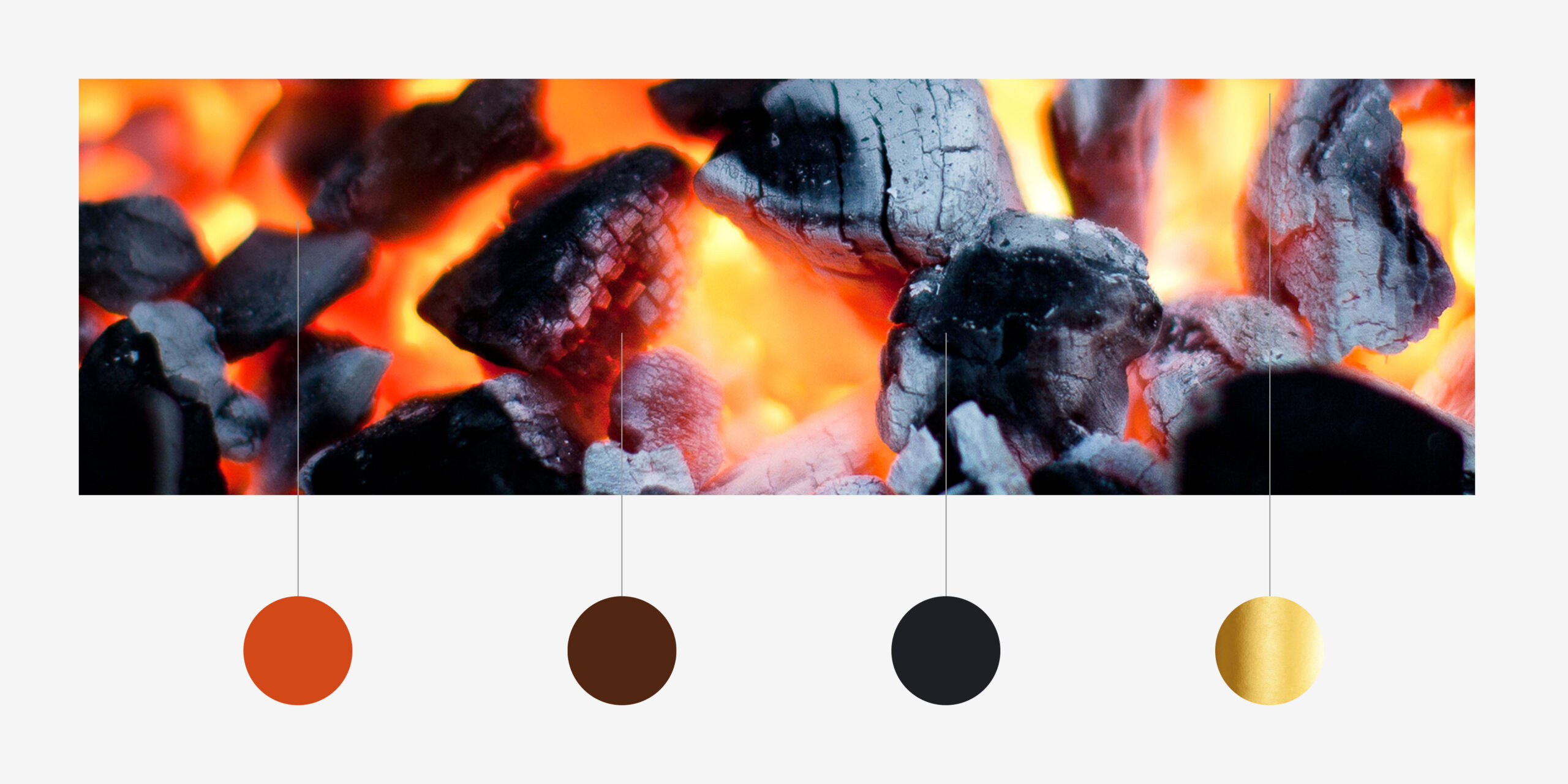
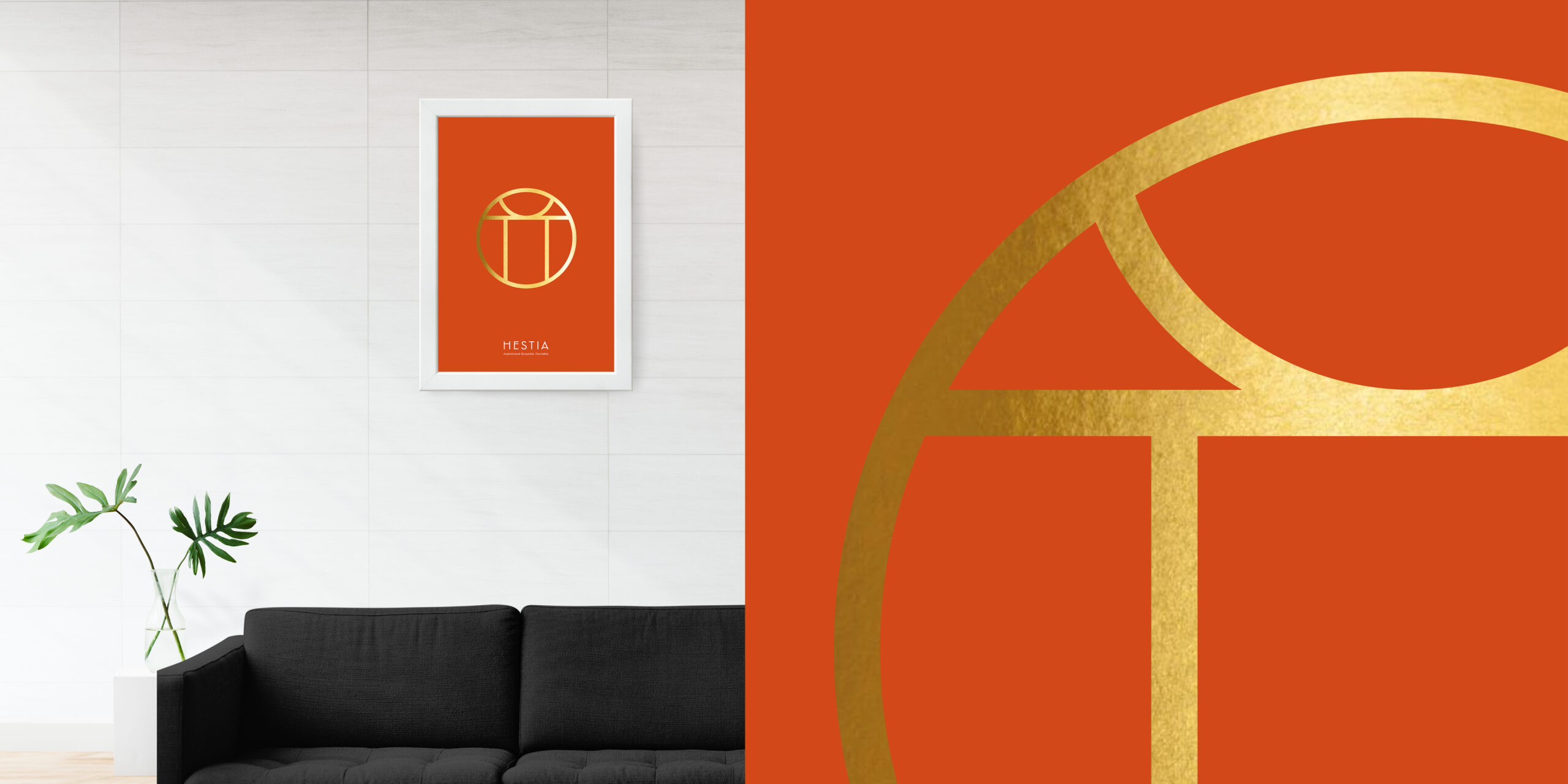
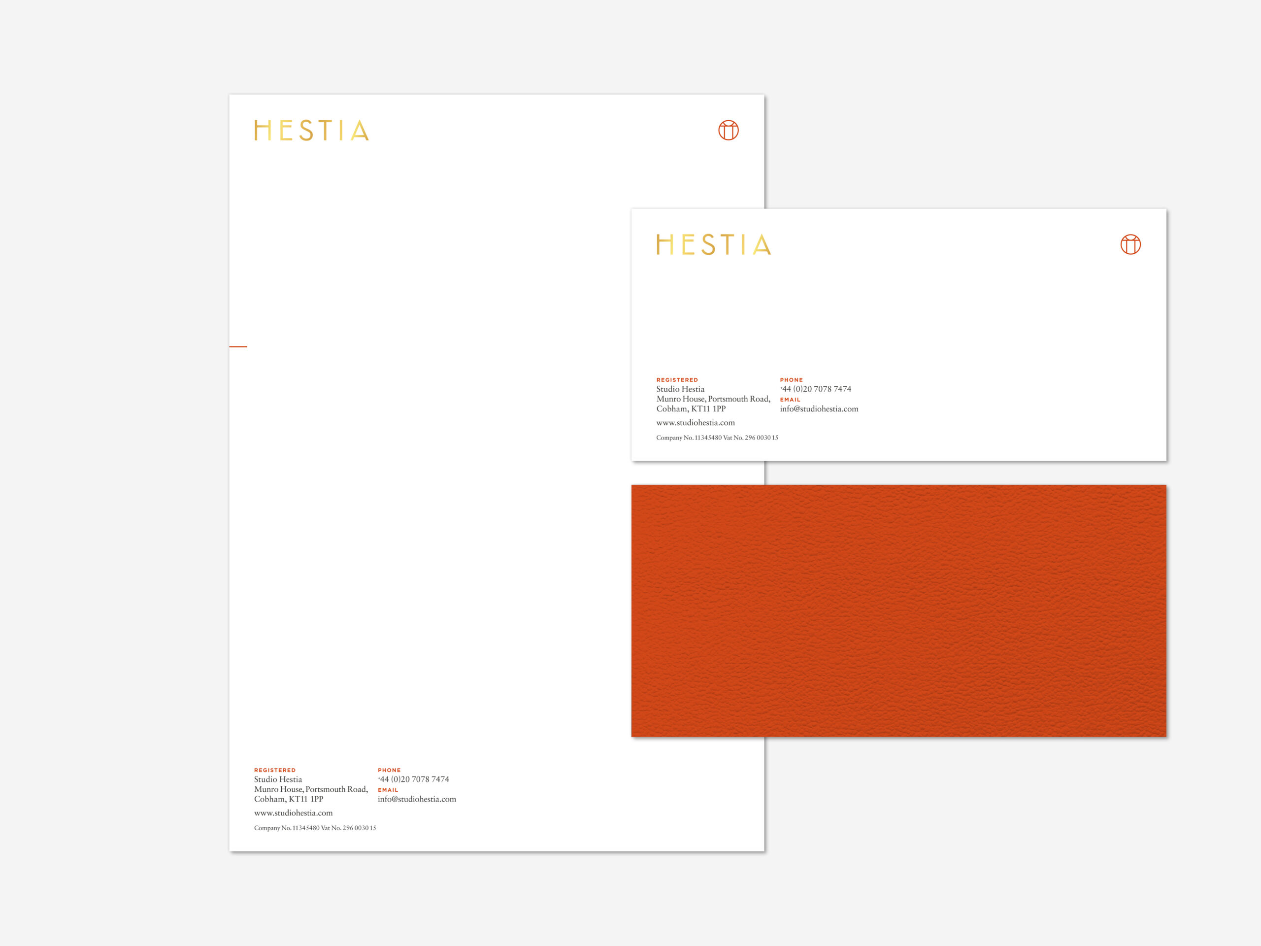
After conducting extensive research, we settled on the name Hestia. We felt this was highly appropriate given Hestia’s name means the ‘hearth, fireplace, altar’, and thus refers to the ‘oikos, the domestic, household, or family’. From a branding perspective, the symbol of Hestia informed our solution, we created an abstract version that takes on its own form – developing something unique with an element of intrigue – providing a talking point whenever clients enquire as what the symbol represents.
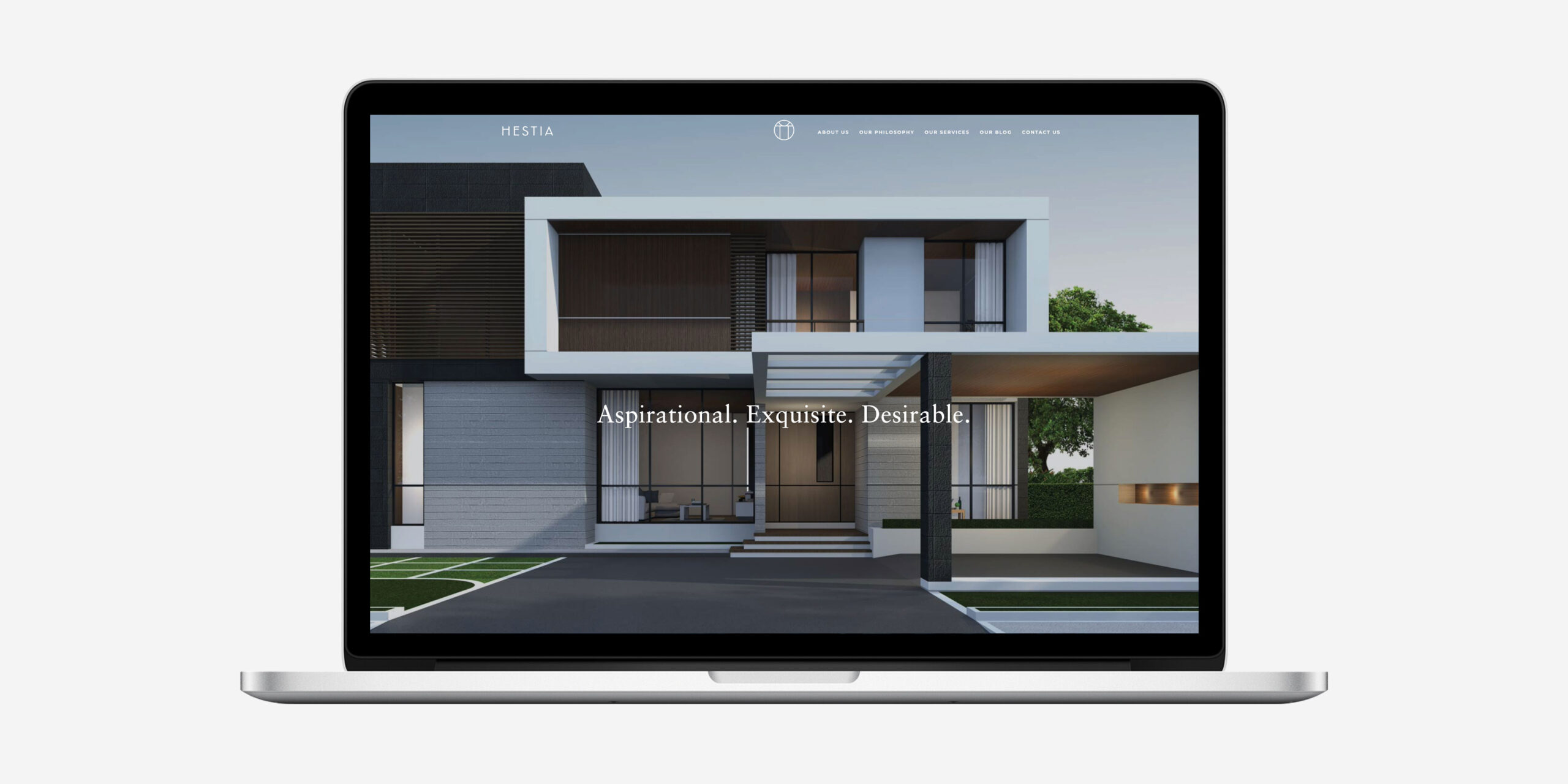
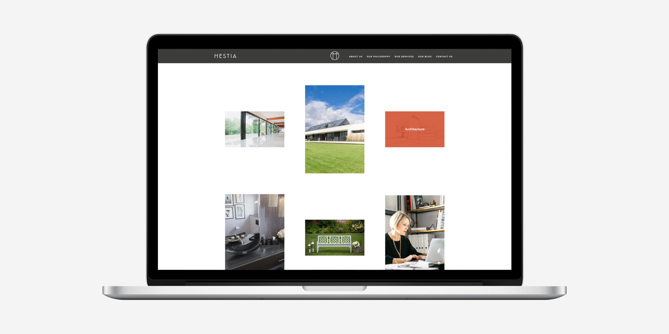
The aim of StudioHestia is to provide all clients with a truly exceptional service in the pursuit of delivering exquisite homes. The brand identity was developed to reflect this vision. To validate the brand proposition – Aspirational. Exquisite. Desirable. – we defined the working method and core services, substantiated through case studies of previously completed projects. The brand was communicated consistently and applied across all touch points.
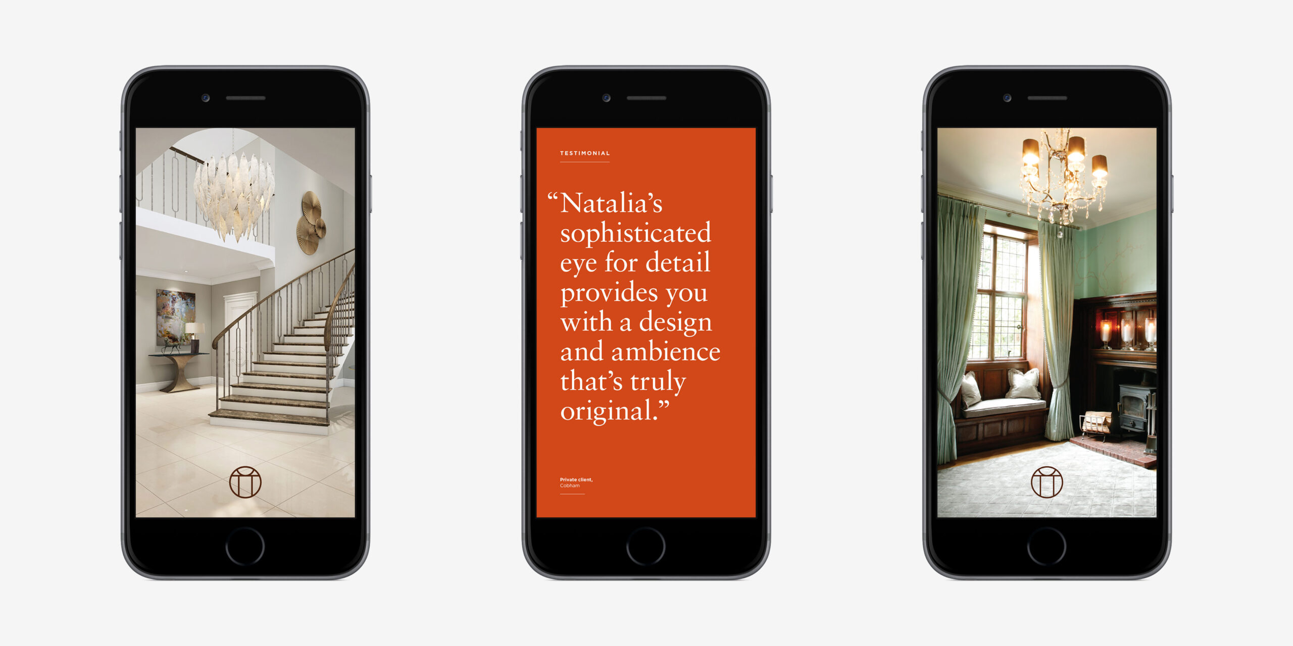
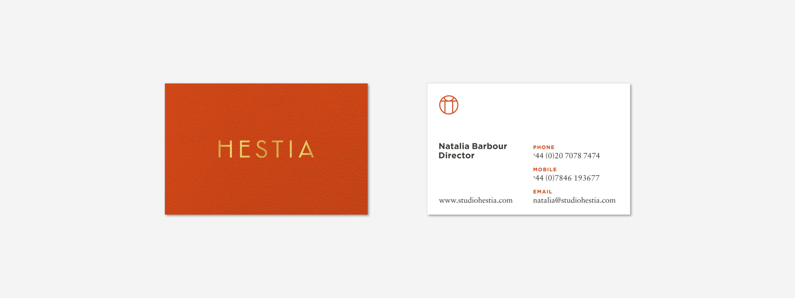
The results deliver a modern, dynamic and considered brand. One that leads with the ‘why’, rather than the ‘what’, and clearly communicates the advantages and benefits of working with a progressive, highly creative interior design practice. The ‘hearth’ theme runs throughout, from the gold-foiled symbol to the extended colour palette of Flame Orange, Burnt Umber and Charcoal Black.
Brand Expression
Aspirational. Exquisite. Desirable.
The brand expression was developed from the core values.
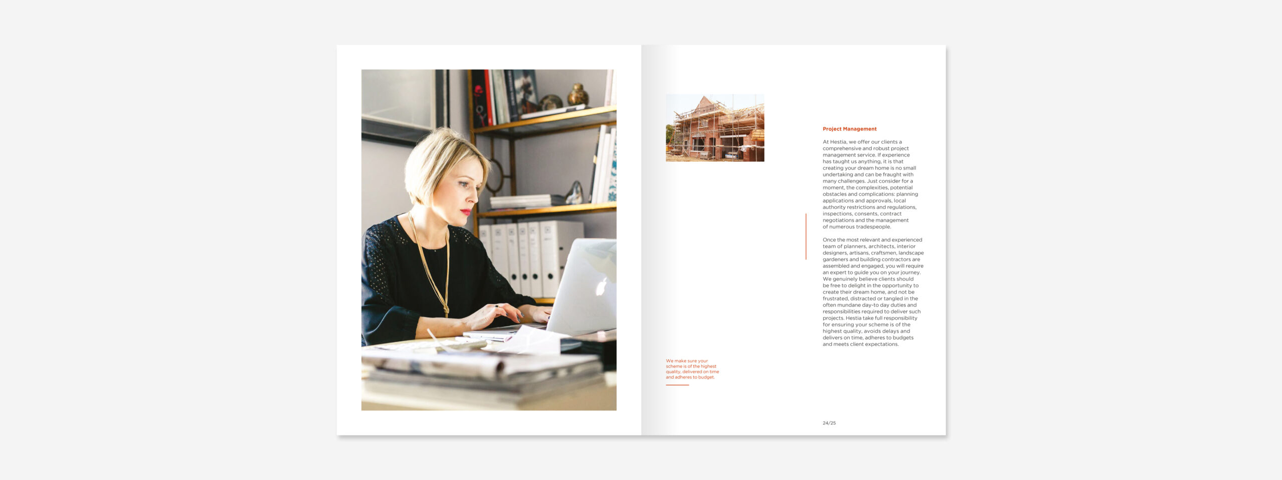
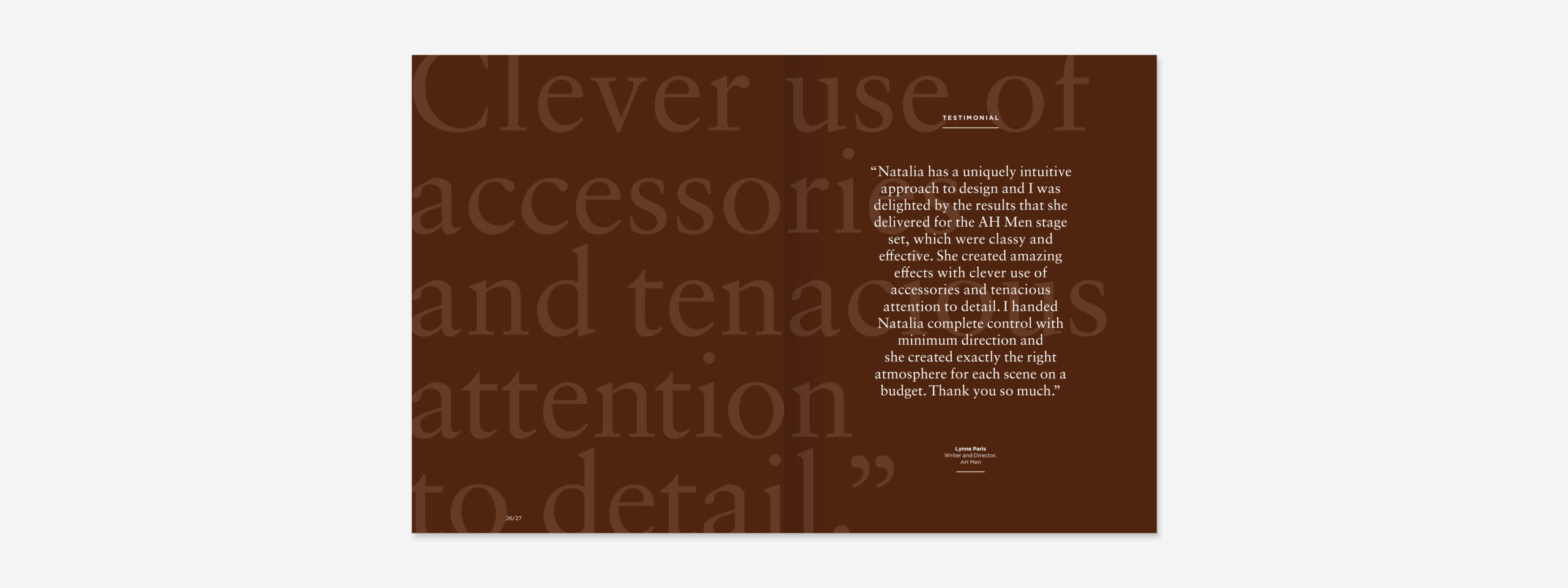
Brochure
The brand expression came to fruition in the brochure design and also its production. An incredibly luxurious quality was achieved by using tactile paper finishes and areas of gold foil.

Interested in Glorious Thinking?
If you like what we did for Hestia we could do something for you.
Mark Ross
Mailing List
Sign up to our mailing list to receive all the latest news.
Check out our privacy policy for the full story on how we protect & manage your submitted data.