
HarperCollins
How do you go about creating a ‘northern’ imprint for one of the world’s foremost book publishers?
You draw from the north’s rich industrious past and illustrious future.
Introduction
HarperNorth is the new imprint of HarperCollins, established in 2020 in Manchester. By breaking the mould – being set up outside the main UK publishing hub of London – they aim to nurture and grow northern writing talent and bring the best voices to the widest national and international audiences. HarperNorth offers a dedicated editorial, marketing and publicity function rooted in the north. In doing so it will appeal to both existing and new readers, competing for a share of the busy entertainment and leisure market. HarperNorth appointed Glorious to create the soon-to-be-launched imprint.
Our journey
Unlike many of the Case Studies featured here, we thought it might prove insightful to take you on a step-by-step journey of the process, demonstrating how we arrived at a final identity. A ‘warts and all’ account if you like.
Defining the brand
The new identity needed to be unapologetically northern, representing HarperNorth’s commitment to discovering and promoting talent from across the north of the UK. It needed to be unique and to differentiate HarperNorth from other imprints in the market.
The brief was that:
We want our books to stand out in all formats – hardback, paperback, ebook or audio.
We’ll be looking for the best in non-London talent to design the jackets and covers.
But… the first step in our visual identity will be our logo (imprint).
It will appear on books, social channels and advertising.
A shorthand for all things HarperNorth.
Our approach
After digesting the brief, we immersed ourselves in the world of publishing, looking at intended audiences, familiarising ourselves with competitor imprints and assessing the various conventions publishing houses adopt for creating imprints.
The Creative Concept Stage is all about exploring creative directions, there are no hard or fast rules, just a range of ‘jumping-off points’ that allow us to share our thinking and enable us and client to discuss and evaluate the range of ideas. The purpose here was to establish a creative direction for the new imprint. Selected concept designs are then taken into the Design Development Stage.
The Concepts
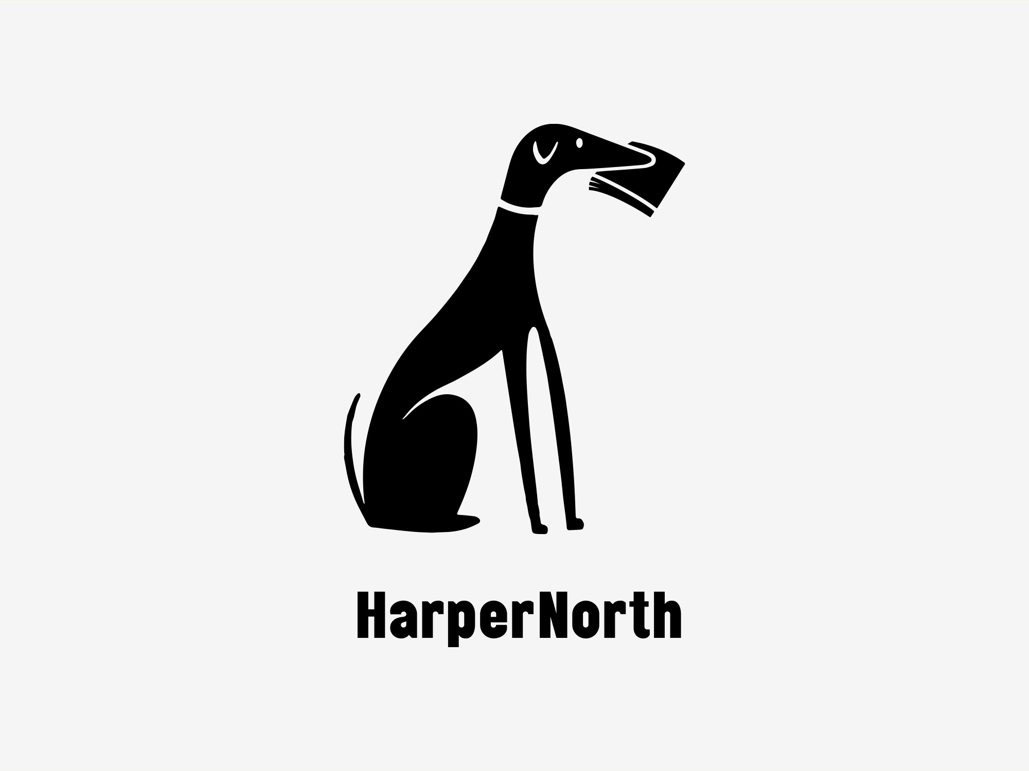
Route A
A dog, like a good book, is often considered a valuable companion. We like the idea of combining the two and borrowing from an age-old tradition, the faithful dog fetching its companion the newspaper.
To help reinforce the geographical cover of the imprint we’ve opted for a whippet like dog, a northern cliché. It also loosely relates to the idiom that northern folk are able to laugh at themselves.
The visual pun helps to deliver on the key value of, approachable. We also believe there are other inherent attributes, such as, trustworthy, loyal, intelligent, playful, the list goes on and on…
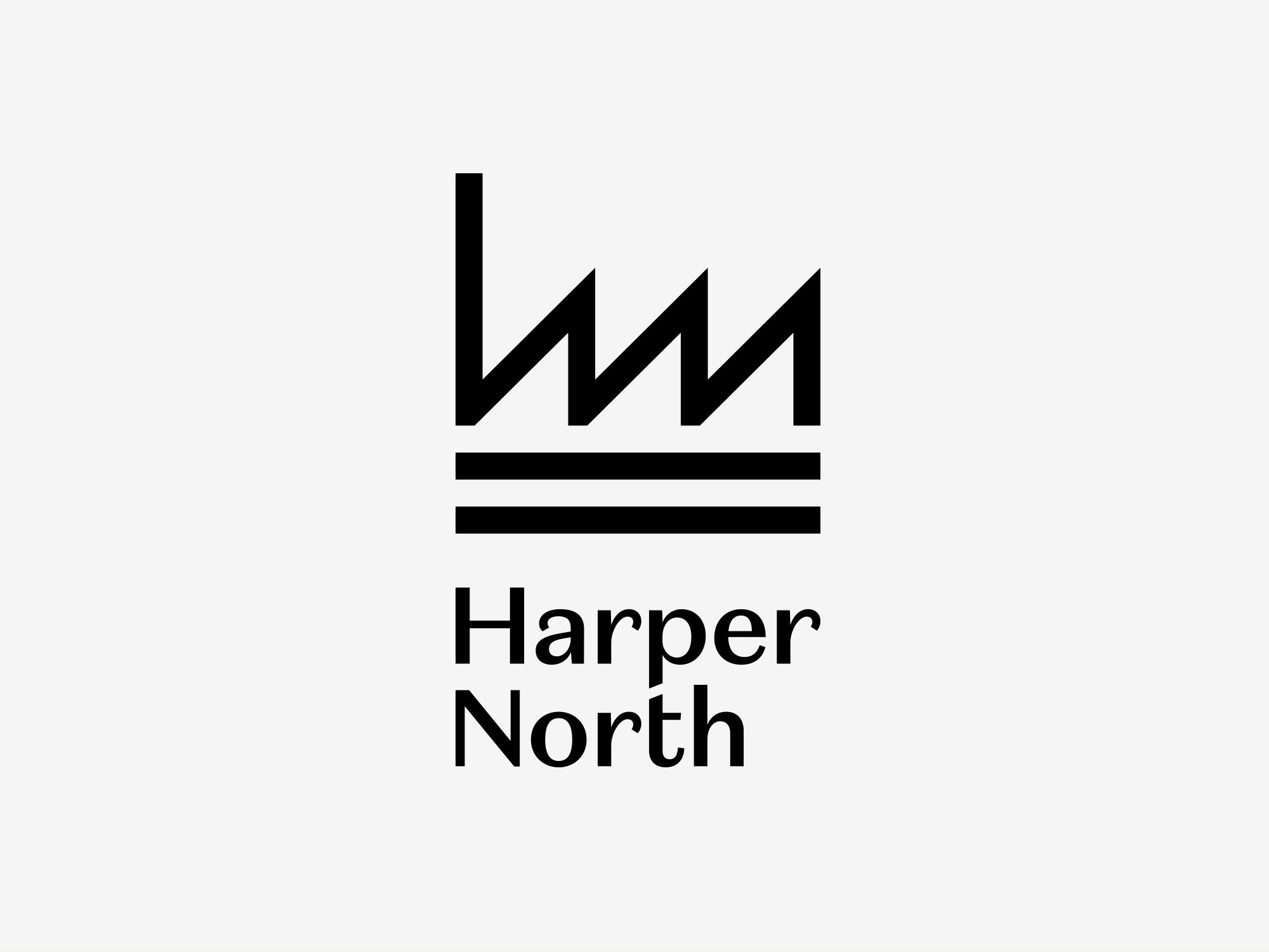
Route B
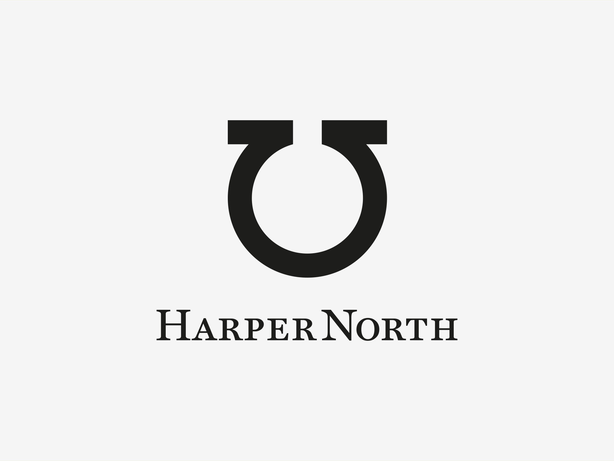
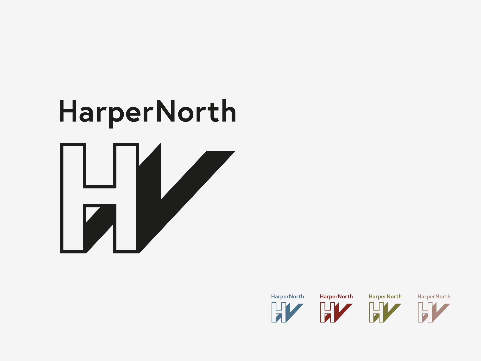
The creation of a strong, bold and unique symbol, one that eludes to the north’s industrious and illustrious past. It is also visually aligned with the HarperCollins imprint – and whereas that alludes to fire and water – our imprint alludes to the industrial nature of the north and the network or waterways.
Exploiting the ‘h’ & ‘n’ character combination, they allow us to create a rather ‘iconic’ symbol. The wordmark in nicely observed with an aligning of the ‘p’ & ‘t’.
Route C
A rather playful solution. By utilising a universally recognised device, we are able to cultivate a brand mark that combines, pointing north and an abstract letter ‘H’ within the form. It also communicates the right way to place the books on your bookshelf!
Route D
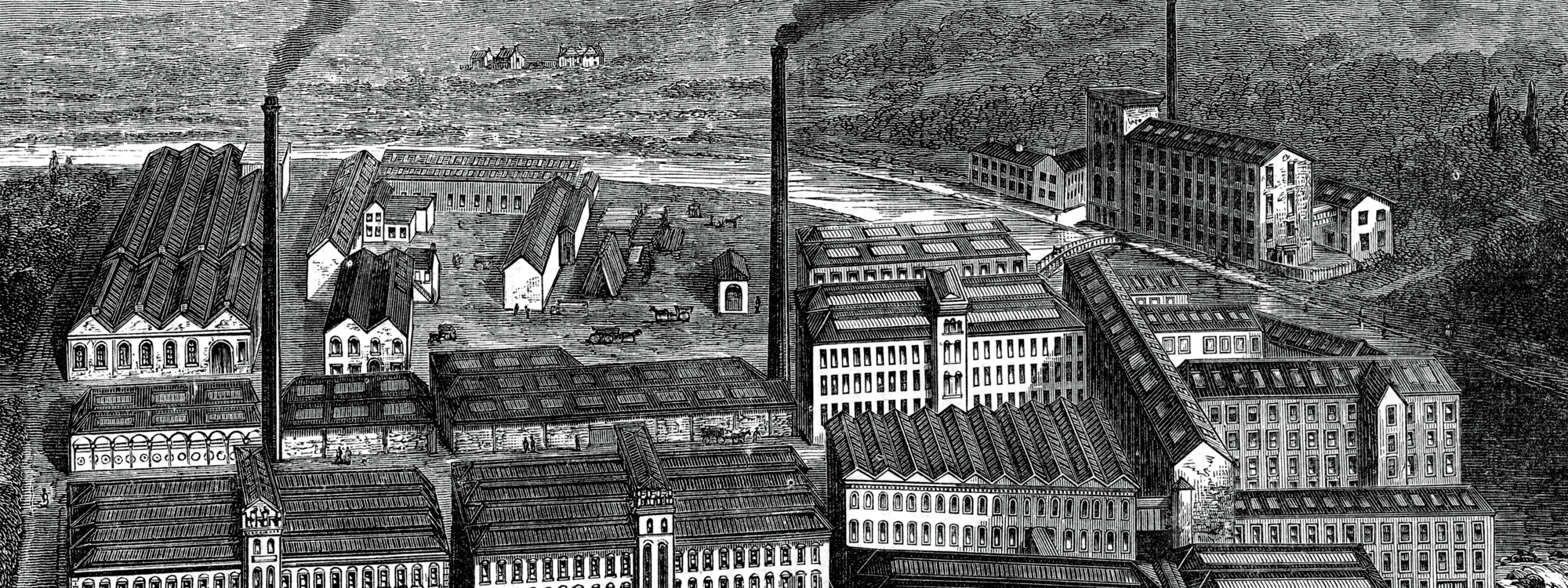
This particular symbol draws on a number of visual references: familiar shapes taken from the mills and factories of Northern England (Industrial Revolution), the often overlooked Bookmark, and the geographical reference of the arrow pointing Northwards (negative space).
The simple, bold and abstract open book shape isn’t an obvious visual clues, but further investigation soon reveals, ‘there’s more than meets the eye’.
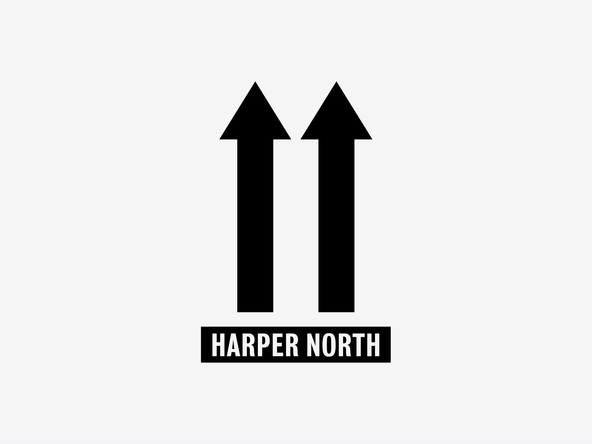
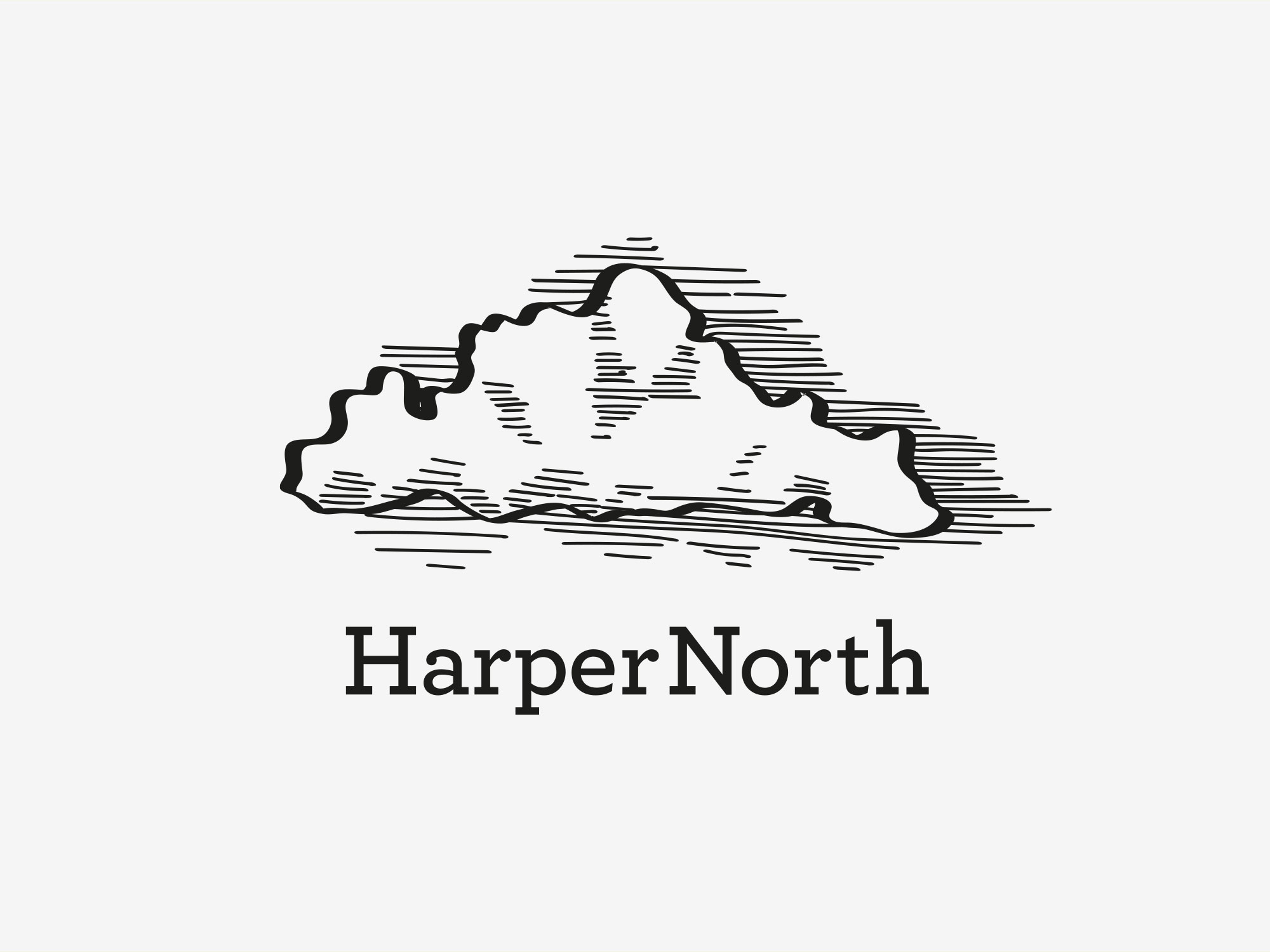
Route E
A nice observation. The symbol represents either pages of a book being flicked through, to represent literature, or, a mountain range to represent the National Parks and rugged landscapes associated with the North.
The Pennines are considered the backbone of the North, while the Lakes, North York Moors and Dales are considered areas of outstanding beauty. They have been the inspiration for much literature past and present. The symbolism is one of strength, depth, stability and intelligence.
Route F
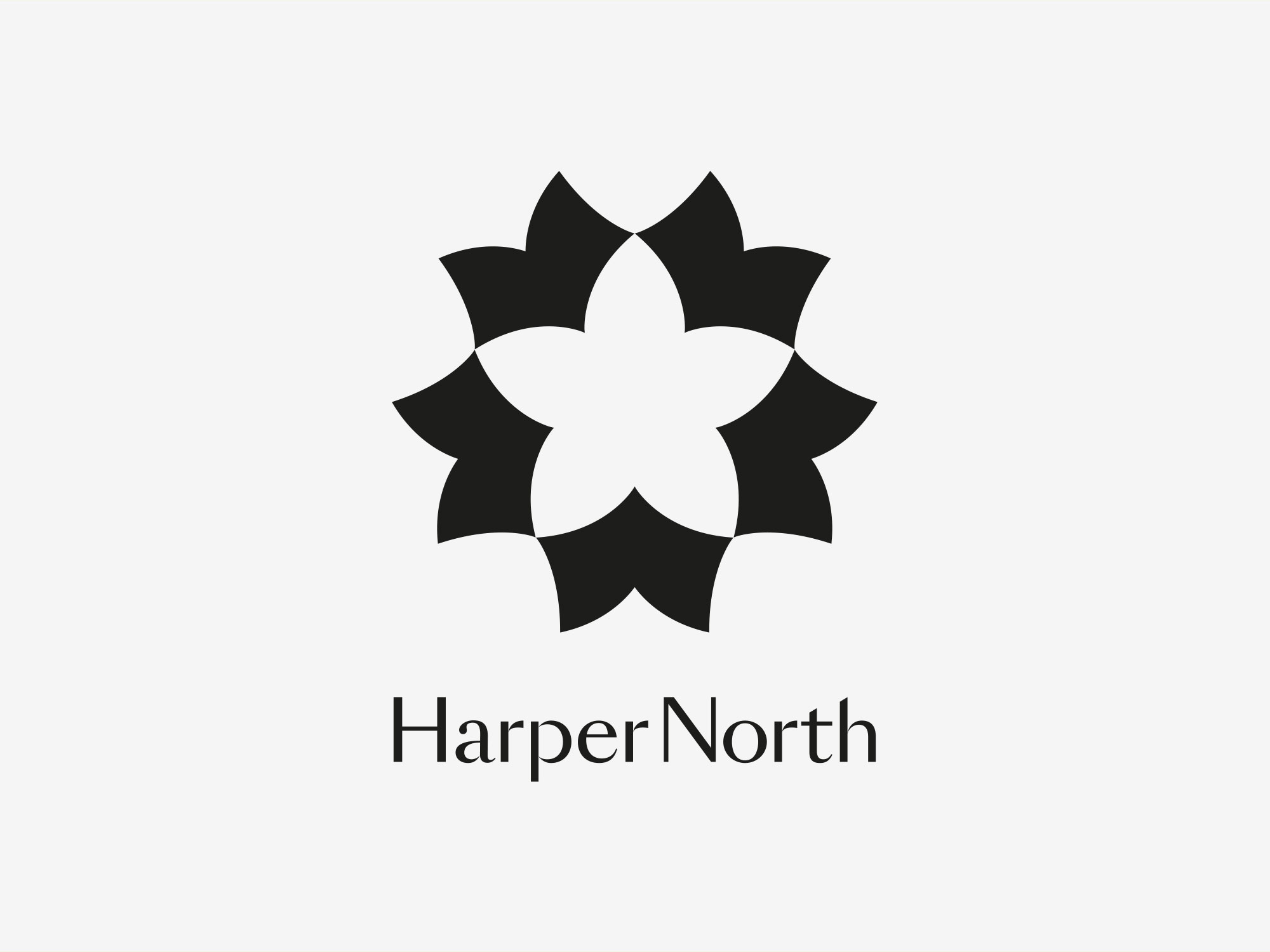
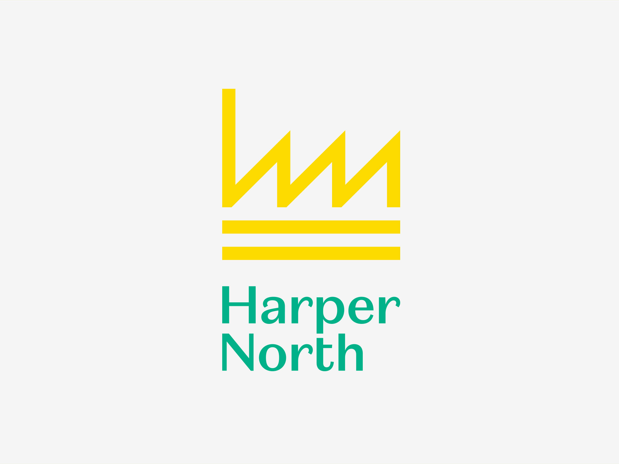
There is a strong association with Fauna & Flora in the North of England, extending further north, even beyond our borders. Think of the County symbols for Yorkshire and Lancashire, as well as the many Emblems from the National Parks, featuring flowers – this is where we drew our inspiration.
This route tips its hat to that badging convention, but rather cleverly uses open books to form a flower symbol. Graphically representing a coming together of di erent literature styles if you will.
Route G
A concept inspired by language. In particular, “the near-close back rounded vowel”, a type of vowel sound. The International Phonetic Alphabet (IPA) symbol representing this sound is ⟨ʊ⟩. It is informally called the “horseshoe u”. The strong U sound in ‘book’ or ‘flood’ is a defining characteristic of Northern dialects.
In addition, the horseshoe is a direct symbol for good luck, and hanging a horseshoe heels up means it stops all the good luck from running out of the shoe.
Route H
William Wordsworth, one of the founders and most important intellects of English Romanticism. He originated from Cockermouth, in the Lake District, considered by many as the heartland of Northern England.
This route takes inspiration from one of the most famous opening lines from one the North’s most famous poets: ‘I wandered lonely as a cloud’…
In addition, the symbolism is a self-deprecating nod to the weather, often associated with the North.
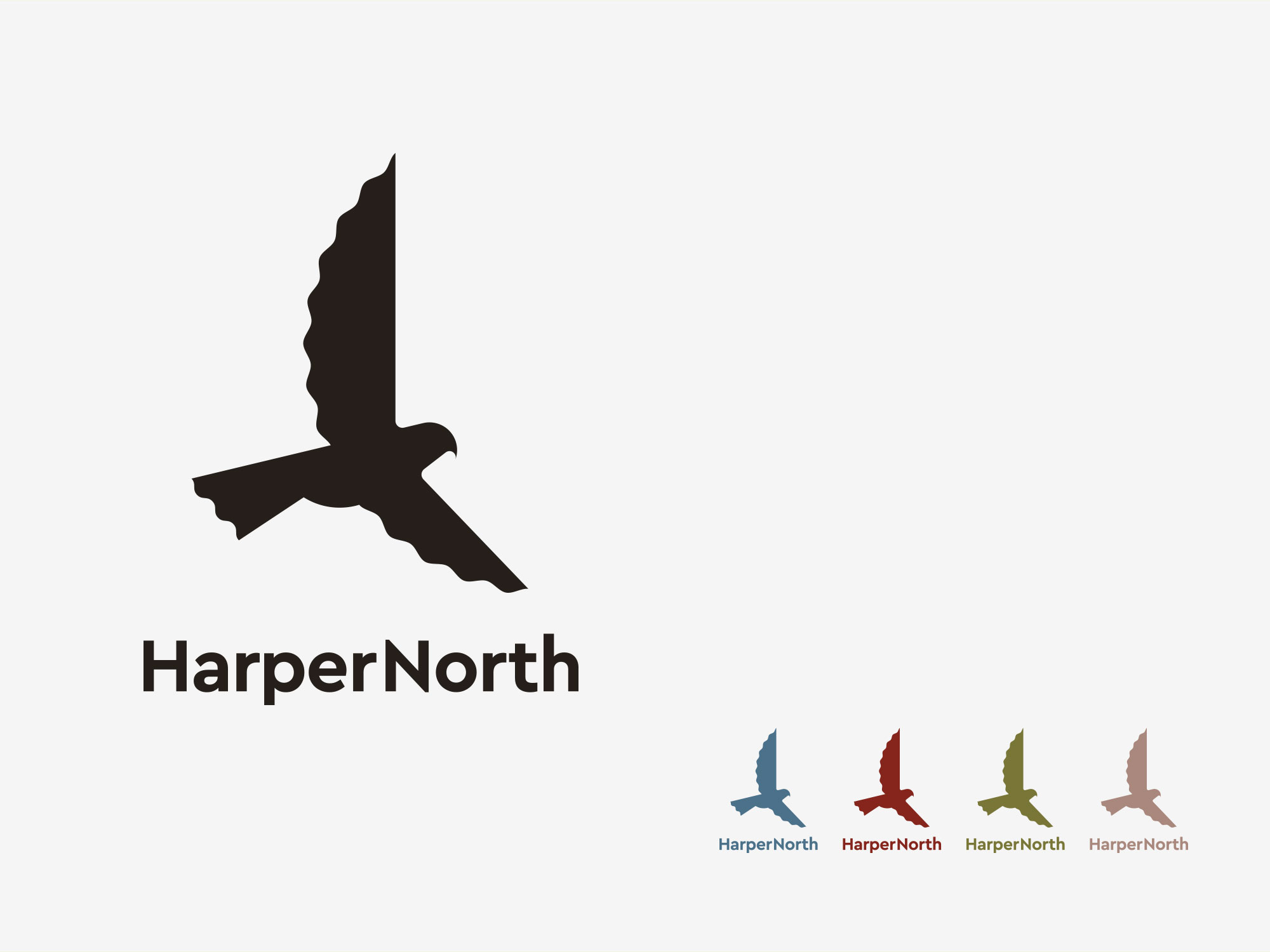
Route I
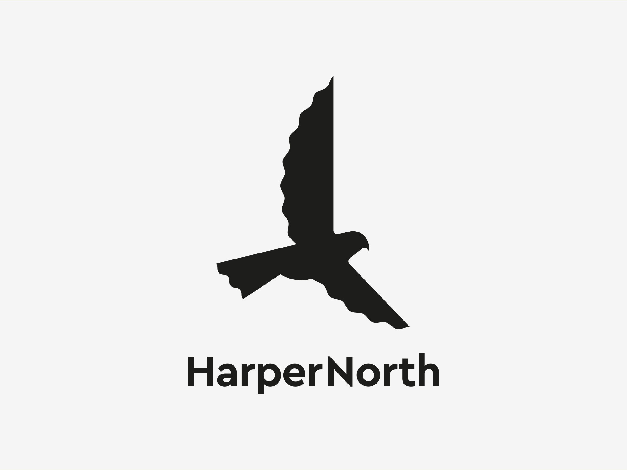
The kestrel is a beautiful and bold falcon, it is widespread throughout the north, though not considered common. Its many attributes include, agility, speed and adaptability.
The stylised symbol combines the distinct lines of the bird with that of an open book (albeit abstract).
The thought that prompted the route was the classic 1960s novel, A Kestrel for a Knave, by English author Barry Hines. Clearly a very Northern story, it simply felt like a nice reference point.
Route J
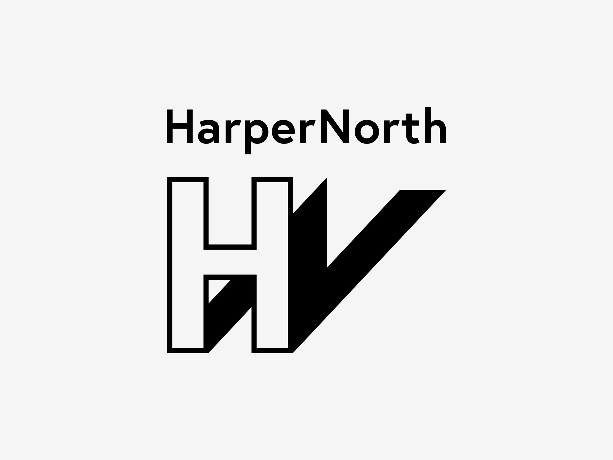
Never judge the book by its cover… was the metaphorical phrase that inspired this concept, the notion you shouldn’t prejudge something by its outward appearance alone.
The cap ‘H’, representing Harper, casts an unusual shadow, the ‘N’ representing North, worthy of a closer look – reinforcing things are not always what they first seem. It’s rendered to give the impression of being 3D, further enhancing the notion of depth.
HarperNorth concept feedback
It was felt that the breadth and depth of creative routes uncovered some interesting thoughts and directions. The client alluded to the fact that a number of the routes would be capable of representing the new imprint equally well. At this stage we agreed to do some design development on a number of the routes, incorporating some valid client observations and evolving some of the creative elements. We would also look to introduce colour. These would be then narrowed down to two routes, enabling the HarperNorth team to go with a firm recommendation, to gain approval from the HarperCollins board.
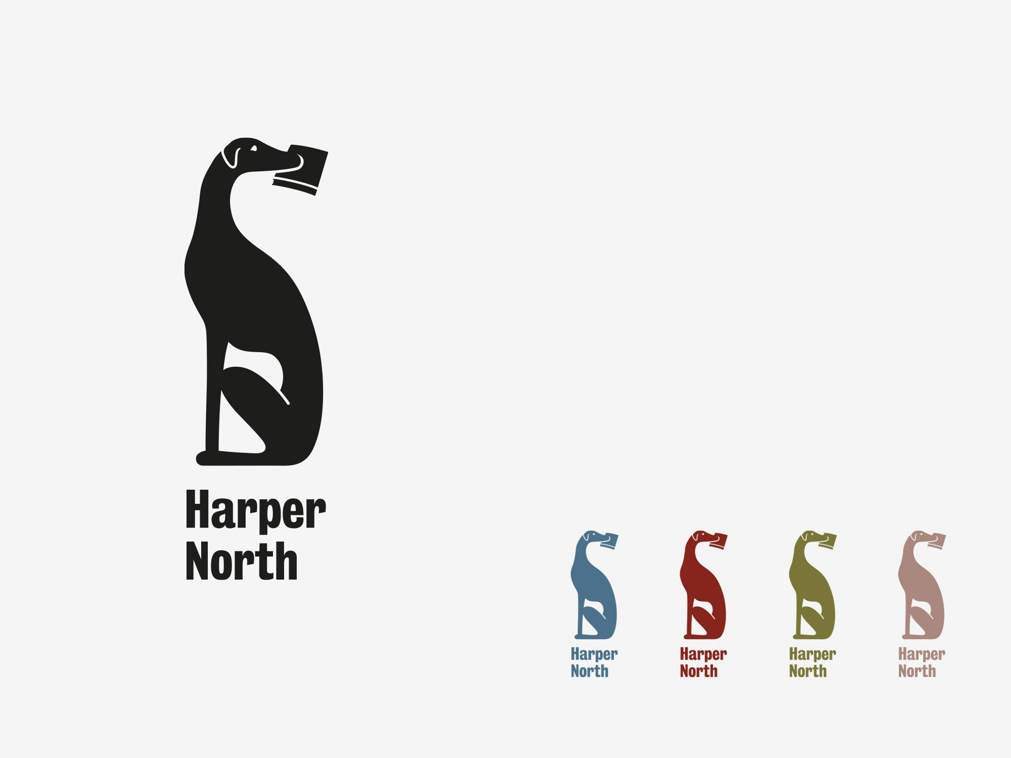
Route A
Considered the wildcard, we looked more closely at the illustration style, as well as the configuration between the dog and the wordmark. We opted to bank the HarperNorth wordmark. This resulted in a neater unit, and we felt placed more emphasis on the book in the whippet’s mouth.
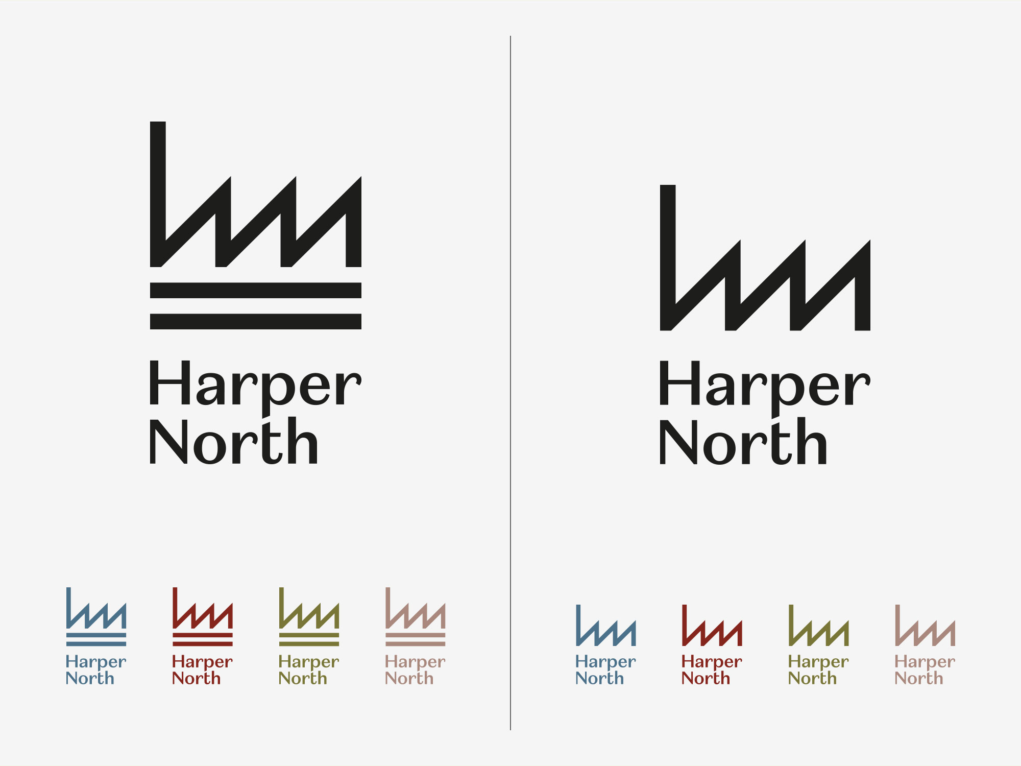
Route B
We agreed to look at an alternative option, using the ‘h’ and ‘n’ symbol as a single device. This was to test if it was more impactful to move it away from the HarperCollins mark. It was also suggested by the client that the direction and axis of the strokes, on the symbol, was rather reminiscent of handwriting. Serendipity we felt, given publishing is rooted in the written word.
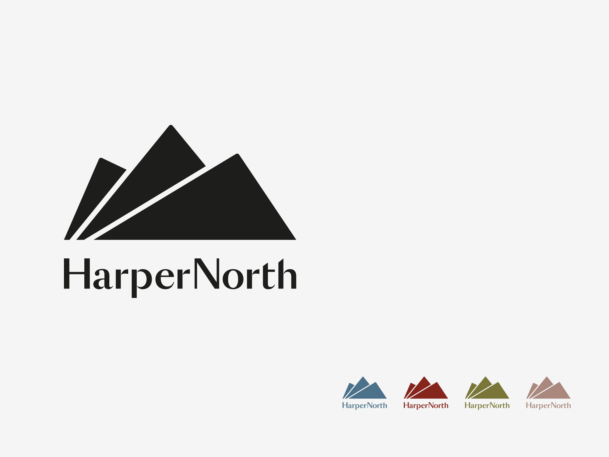
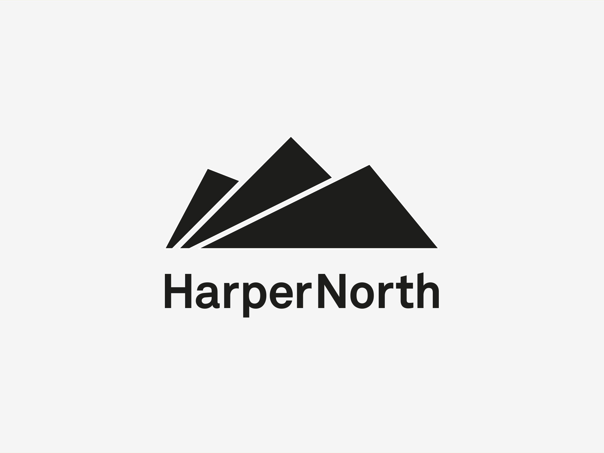
Route E
We developed the symbol so that the three shapes depicting the mountains / pages were a little more dramatic. We also changed the style of the wordmark, as the first iteration was considered a little too masculine – softening it would be more desirable given the different genres of books it would grace.
Route I
Other than look at colour, no additional work was undertaken on the ‘kestrel’ route.
Route J
Likewise the ‘never judge a book’ route.
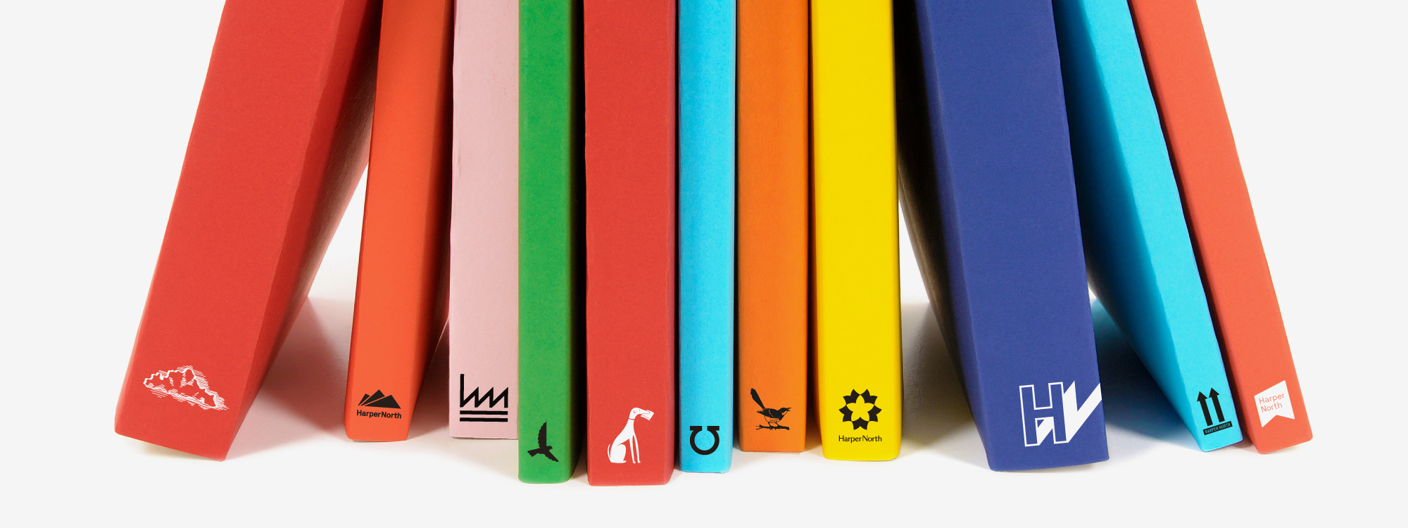
HarperNorth development feedback
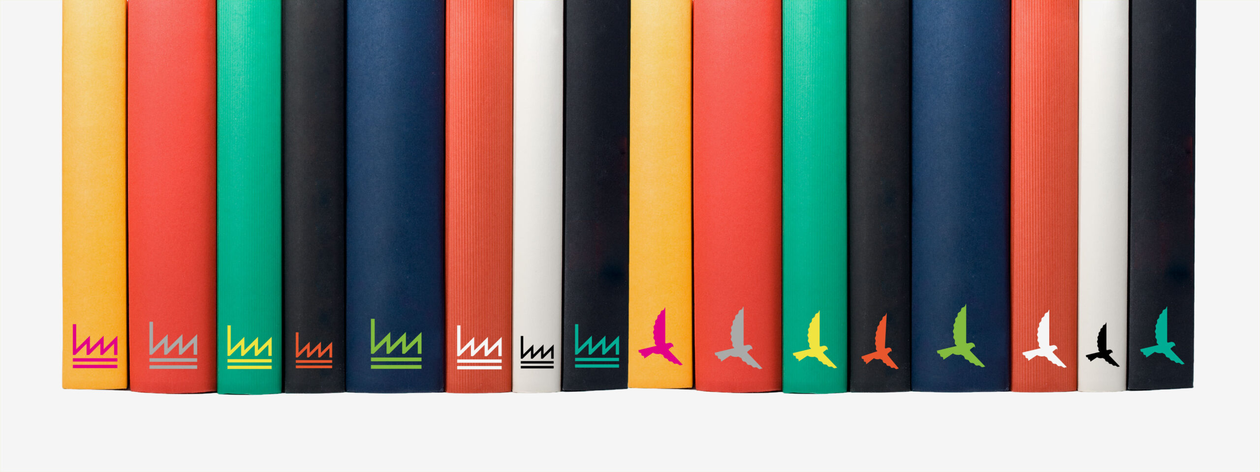
The refined options were discussed and assessed. It was determined that the HarperNorth team wanted to present Route B, with one alternative, Route I – purely as a fall-back should the first choice imprint be blocked for some unforeseen reason. We drew up two versions of each logo, and applied them to the spines of books, demonstrating the proposed colour palette.
Route B
Route I
And the winner is…

“Glorious understood us immediately – they brought fresh ideas, creative energy, authenticity and flexibility to the project. We have already had a huge amount of positive feedback on the new logo, which we believe both roots us in the region and positions us as future-focussed. We’ve had a great rapport with the team at Glorious and look forward to continuing our working relationship with them as part of our collaboration with talent across the North.”
Publishing Director, HarperNorth
Interested in Glorious Thinking?
If you like what we did for HarperCollins, imagine what we could do for you.
Mark Ross

Mailing List
Sign up to our mailing list to receive all the latest news.
Check out our privacy policy for the full story on how we protect & manage your submitted data.