
Greater Manchester Combined Authority
How do you create a visual framework capable of bringing brand consistency and cohesion to the entire Greater Manchester region?
You develop a comprehensive and inventive place-identity, one that is as robust as it is flexible.

The Brief
The Greater Manchester Combined Authority (GMCA) commissioned Glorious to create a place-based brand and Visual Brand Framework for the Greater Manchester (GM) region. Working with the Thematic Areas (Key Promises) & pan-GM Strategic Narratives, we were tasked with creating a brand identity system to build brand equity and ensure that all visual communications, whether at a local, regional, national or international level, were consistent and coherent.
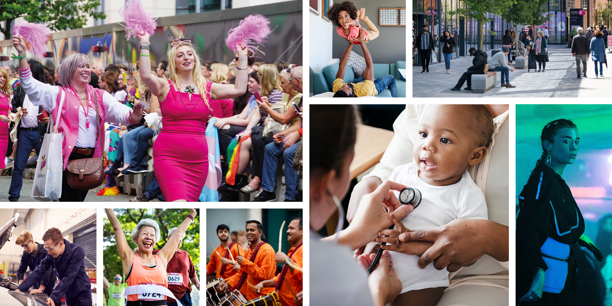
It was vitally important that the ‘voice’ and ‘image’ of the region were aligned. The GMCA Communications & Engagement team manage the 10 borough councils, as well as the Mayor, the NHS, transport, police, fire service, partner businesses, community and voluntary sector organisations, which added greater complexity to the project, in ensuring their existing brands would be complimented.
Our Response
In order to meet all project objectives, we recognised the need to create a comprehensive and highly adaptable identity system. Glorious started by fully immersing ourselves in the strategic narratives – only when armed with knowledge and understanding, could we then begin to evolve and construct the Visual Brand Framework that would accurately reflect the ambition and vision of the whole Greater Manchester region.
Due to the comprehensive and diverse range of stakeholders – as well as the disparate nature of the communication channels and applications – it was imperative that the visual toolkit was expansive, adaptable and offered sufficient flexibility.
However, that requirement needed to be balanced with consistency of implementation in order for it to gain traction. A detailed set of guidelines were written and produced to ensure that all brand assets and components were carefully managed and applied, to increase equity and recognition.
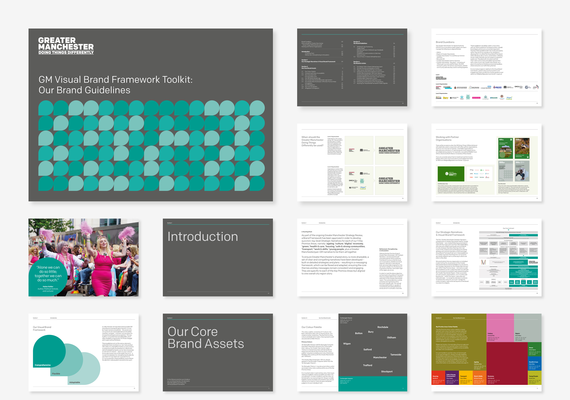
The Visual Brand Toolkit
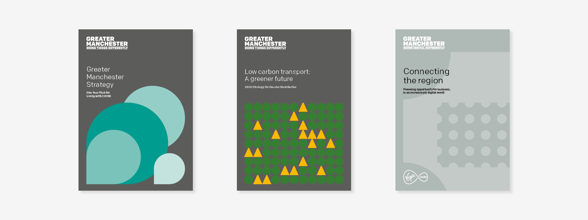
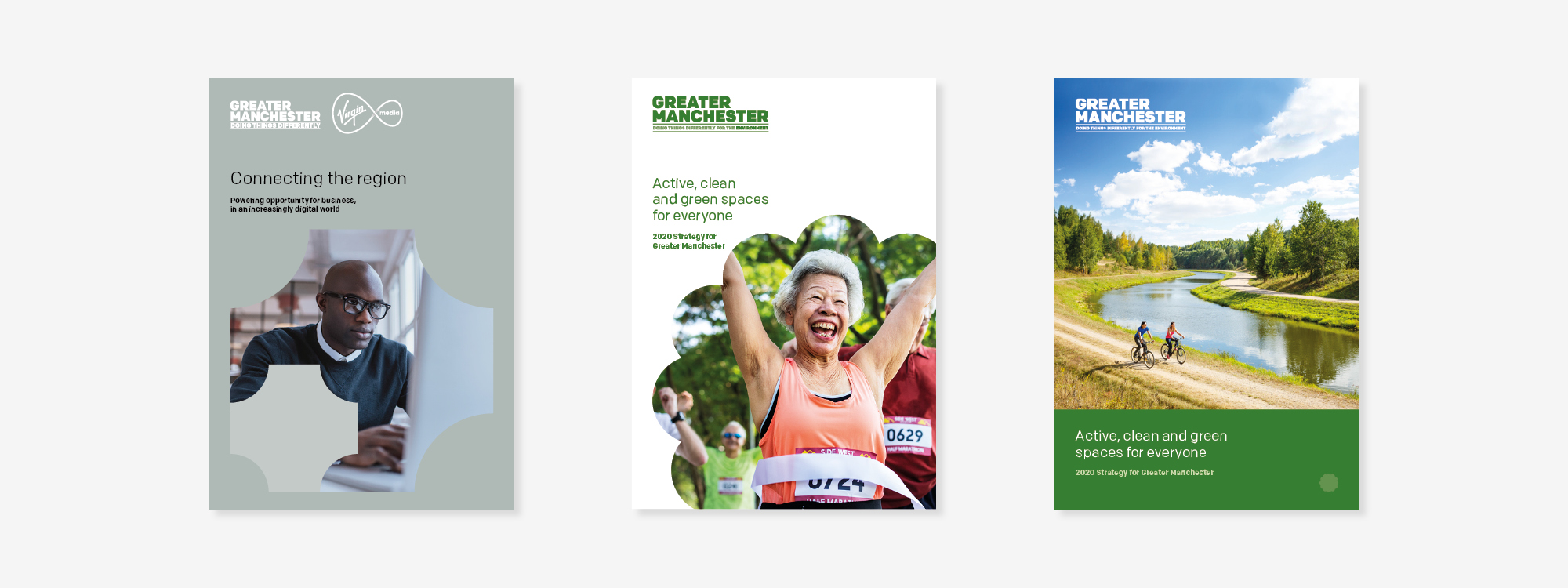
The expansive brand toolkit we developed, is wholly inclusive and represents all 10 boroughs of the region equally. A consistent articulation across all platforms and communications, in both on and offline channels, constitutes an instantly recognisable and unique identity. By developing a well-articulated framework, we have been able to incorporate an element of brand ‘stretch’ – that is to say, the guidelines encourage evolvement of the toolkit when needed – a key requirement, given that the brief stated the identity should have the ability to remain current,over a period of time.
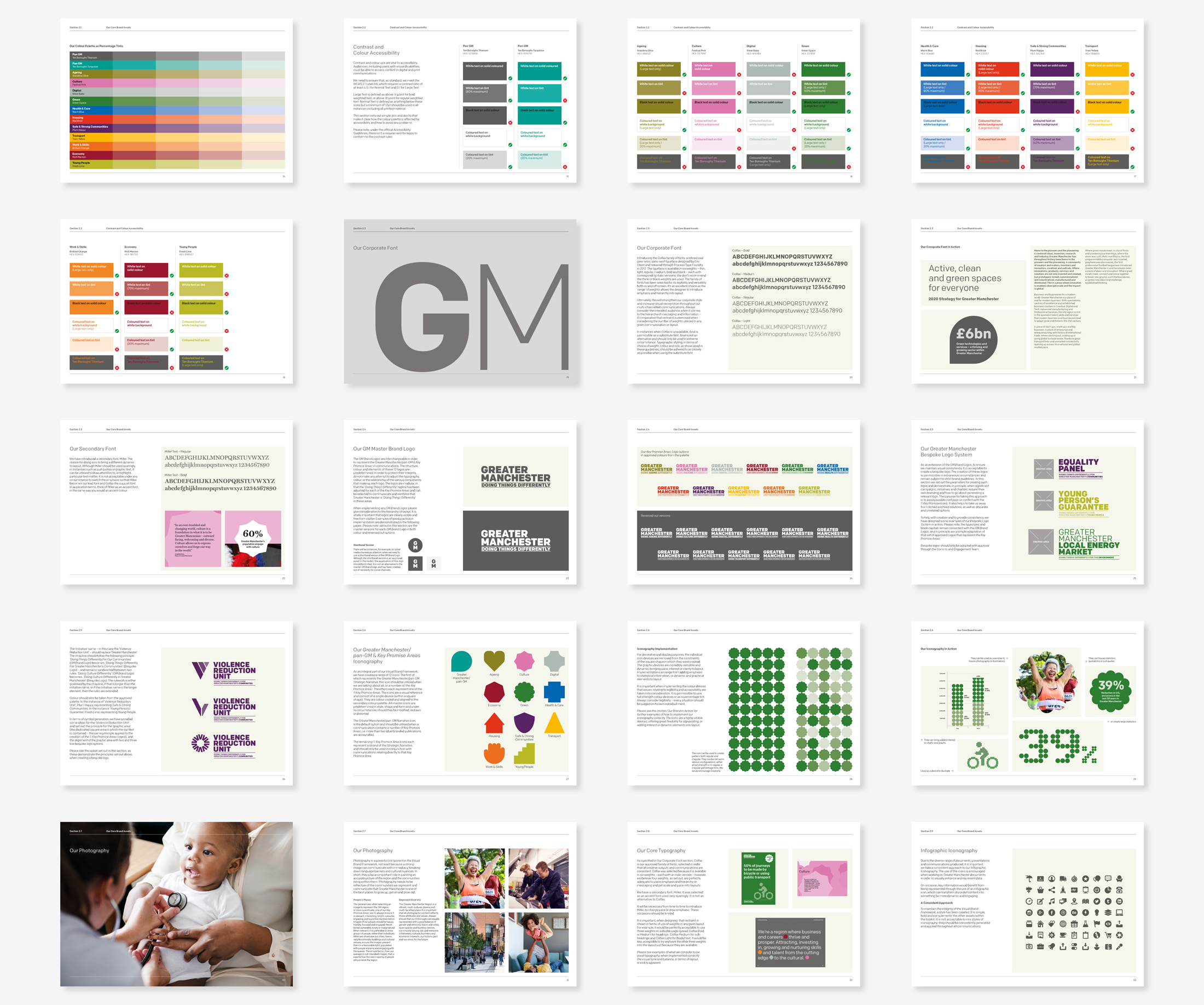
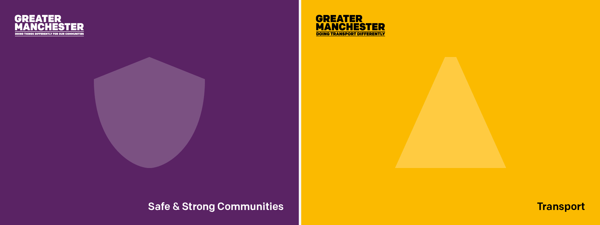
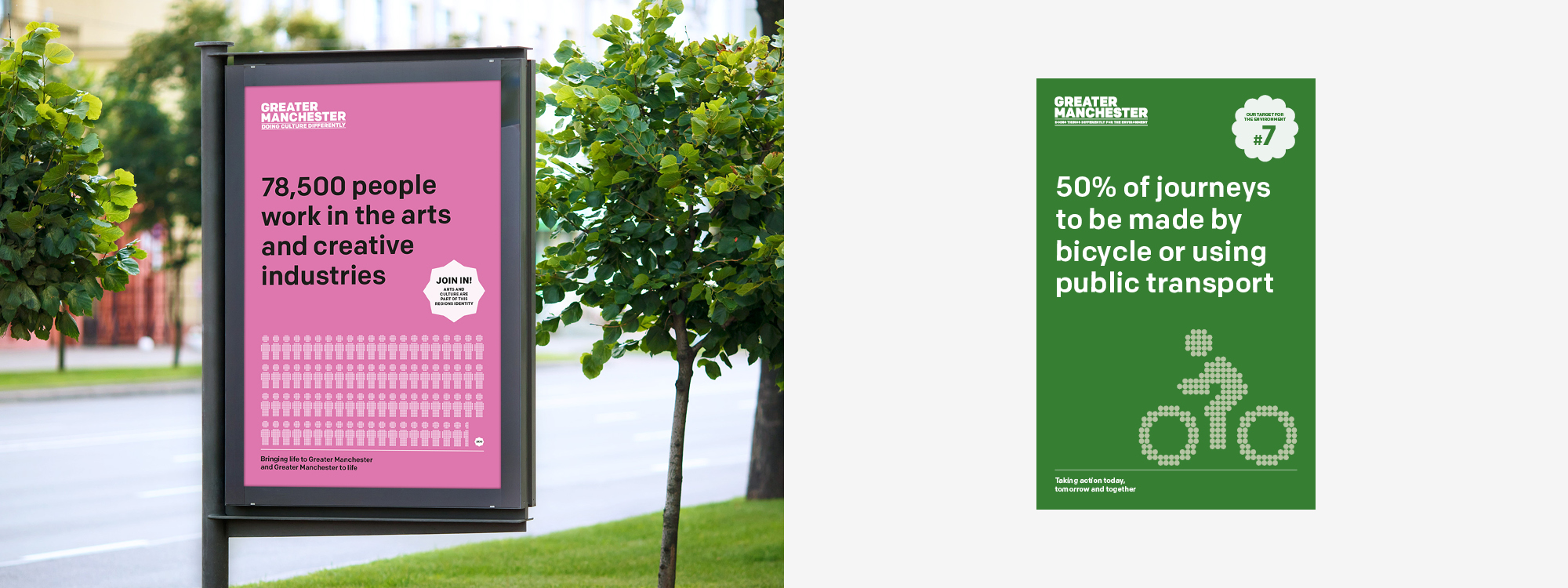
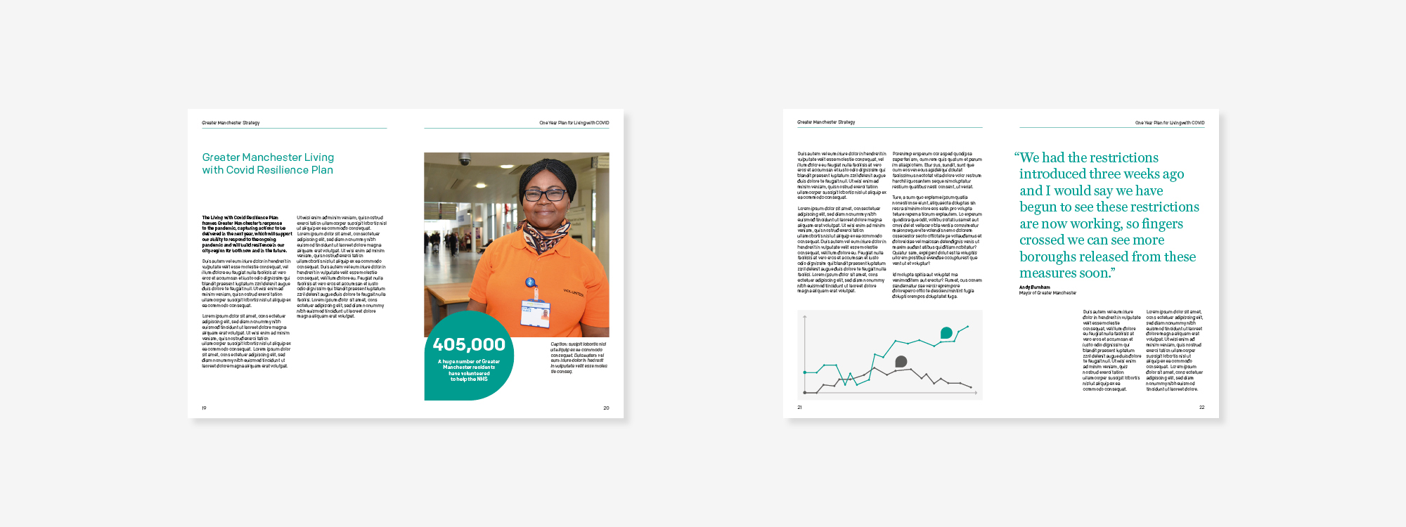
The brand guidelines we created cover a vast range of applications: from the use of icons, fonts, colours, images and illustrations; to master grids, templates, layout hierarchy and design aesthetic. In addition, they tackle issues relating to: messaging, tone of voice, the use of statistical and technical information, as well as, the use of charts and infographics.
Iconography
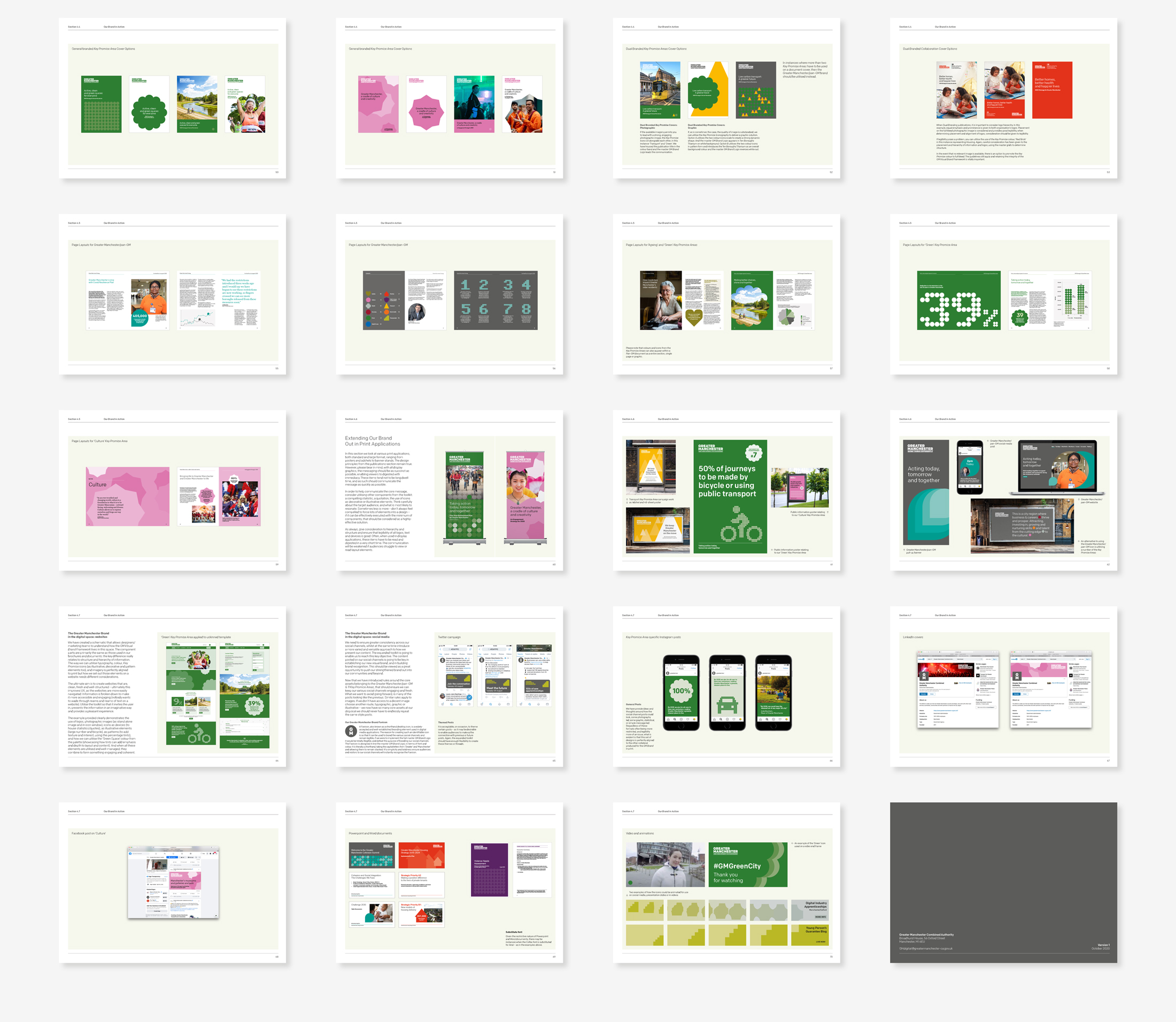
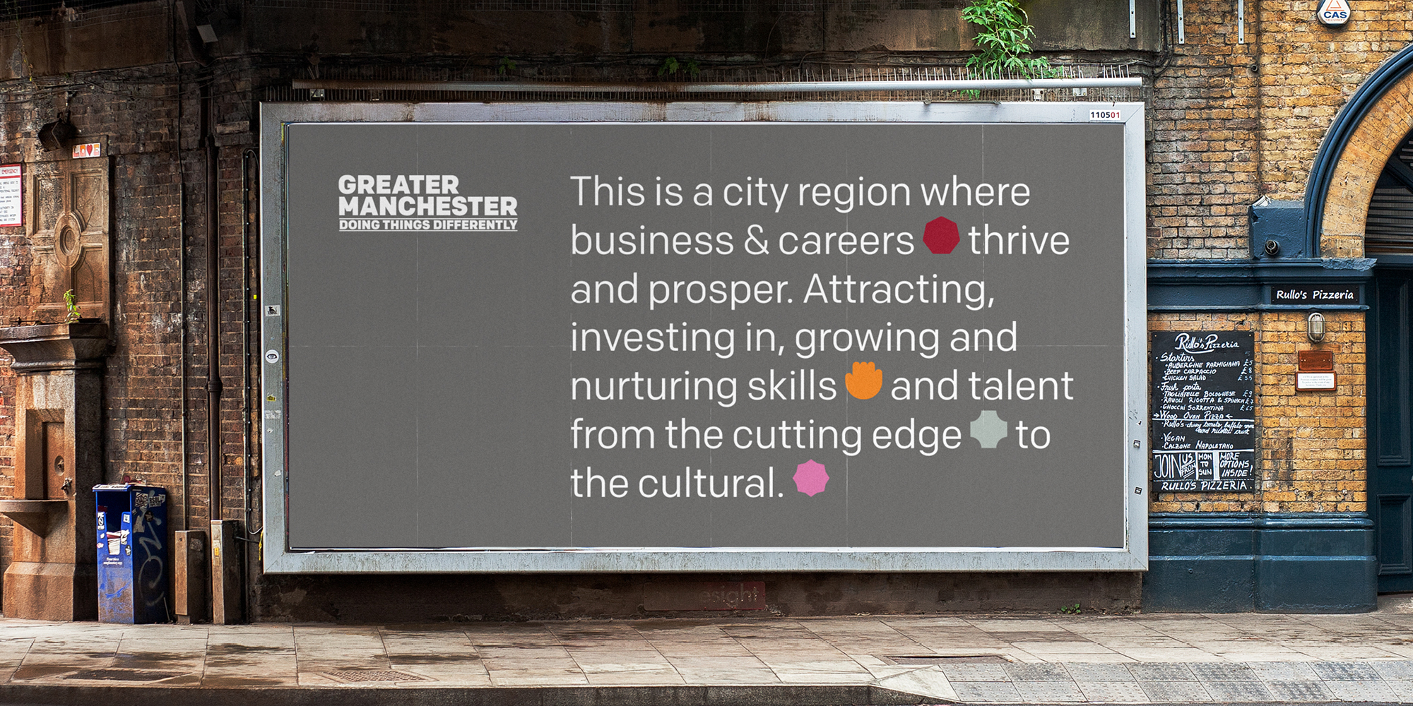
Integral to the Visual Brand Frameworkwere a set of 12 icons, each representing a Thematic Area of the Strategic Narrative. These colour coded icons provide a distinct visual reference when used only in conjunction with communications relating directly to that element of the narrative. The icons play a lead role in badging, signposting and differentiating content, collateral and materials.


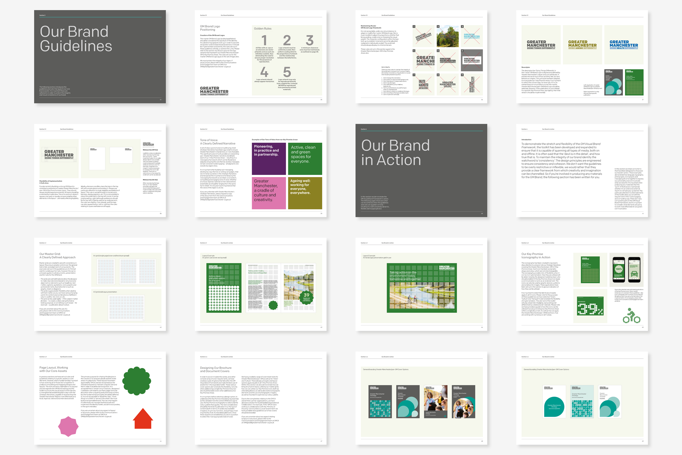
Implementation
To demonstrate the flexibility of the Visual Brand Framework, the toolkit was developed to ensure that it was capable of spanning all types of media. To maintain the identity’s integrity, the guidelines go into great detail, providing the blueprint as to how all stakeholders gain maximum leverage from the toolkit. The design principles are engineered to guarantee consistency and cohesion, however, we wanted to also ensure that they not be overly restrictive or inflexible. As a result, they provide a clear framework from which creativity and imagination can be channelled.
The Outcome
It was fundamentally important to showcase how all of the identity components can come together to create engaging pieces of design and compelling layouts, which has been demonstrated so far, through its wide use across a range of channels and contexts within the region.
We are thrilled to have defined and established a unique and versatile GM Visual Brand Framework and identity, ensuring the GM region brand is impactful and recognisable at a local, regional, national and international level, with a lasting longevity to see both GMCA and the region, through its ambitious future strategic aims.
“GMCA worked with Glorious on a really unusual brief; to develop a place-based brand for the work being undertaken on behalf of Greater Manchester. The work needed to reflect the style of the city region, while complementing – not contrasting or copying – a wide range of partner brands. It had to be flexible, allow for evolvement, and blend where there were dual themes to be usable by our partner organisations. The end result was a comprehensive suite of treatments that were visually unique and versatile, while at the same time being part of a family of identities that were clearly connected.”
Assistant Director
Comms, Engagement & Campaigns, GMCA
Interested in Glorious Thinking?
If you like what we did for the GMCA we could do something for you.
Mark Ross

Mailing List
Sign up to our mailing list to receive all the latest news.
Check out our privacy policy for the full story on how we protect & manage your submitted data.