
Buxton Festival
How do you bring a company up to date with a 1903 design?
You create a new brand identity based on an original, iconic mosaic that is still a feature of Buxton Opera House.
The Brief
Buxton Festival isn’t just another regional arts event and it’s been acknowledged as one of the UK’s best tourism experiences and has been described by The Independent as ‘one of the UK’s best arts festivals’. But they felt they were in need of a new look and feel for their marketing materials. We suggested the time was right for a rebrand and they agreed.
Our Response
The brand identity was based on the original mosaic in the Buxton Opera House, constructed in 1903, bringing an authenticity and a sense of heritage to the Festival. All marketing materials were re-branded with the festival programmes designed to appeal to a new, younger audience whilst retaining the loyalty of the existing core audience.
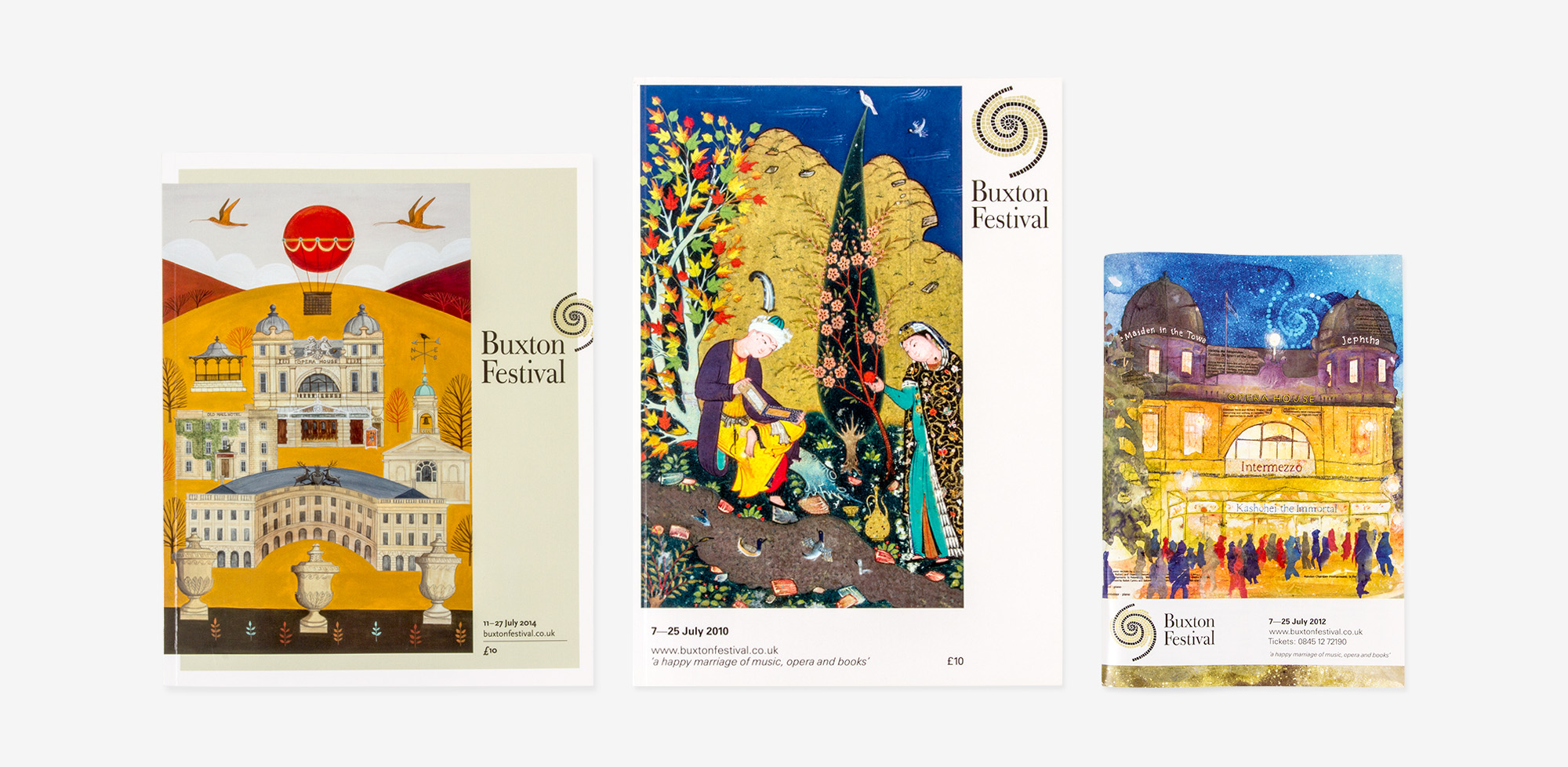
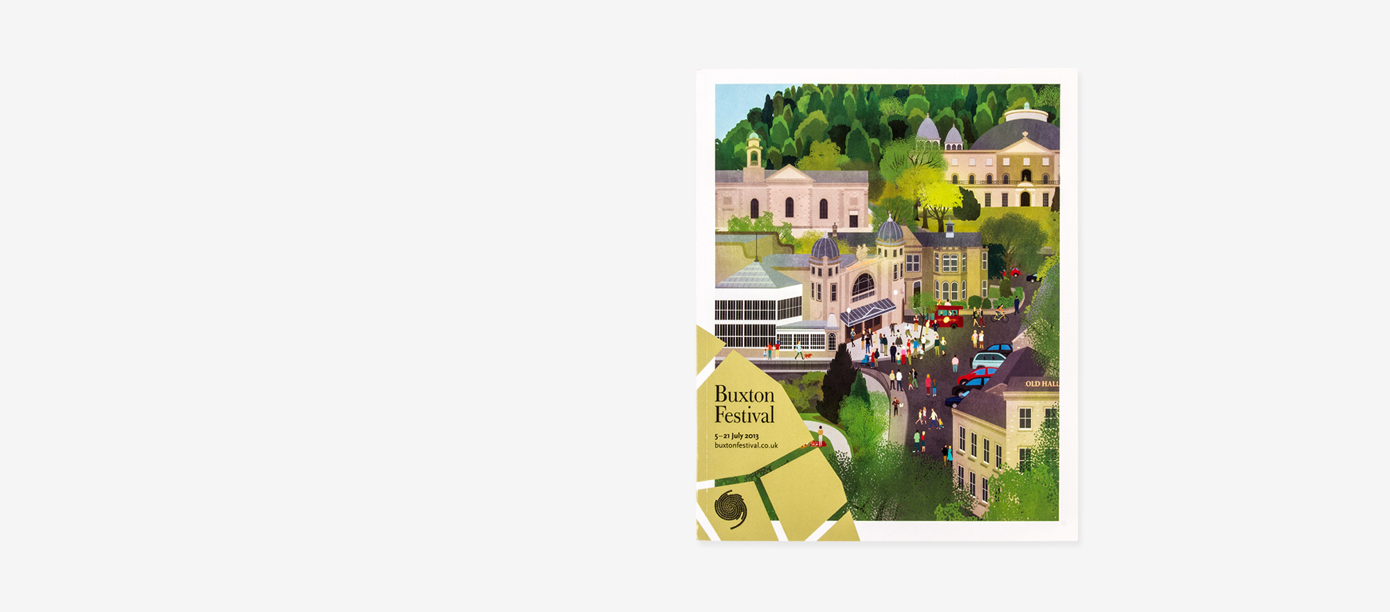
Cover Designs
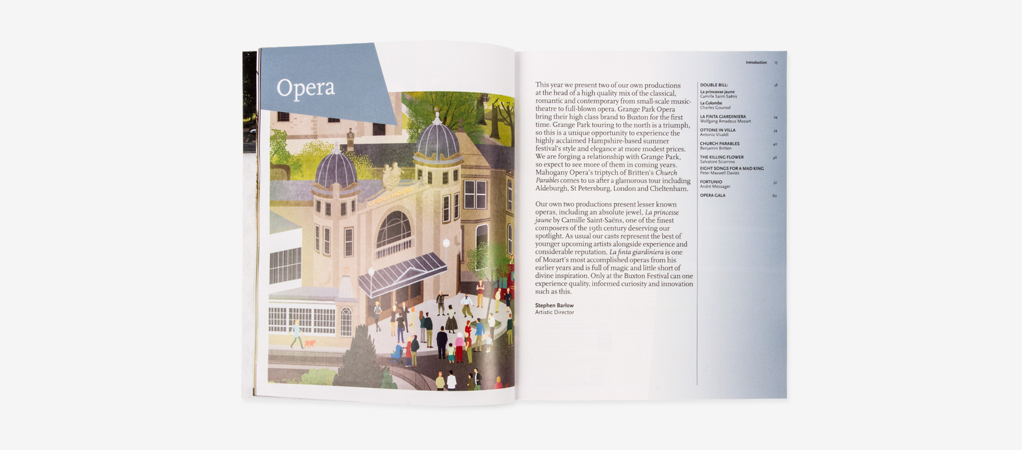
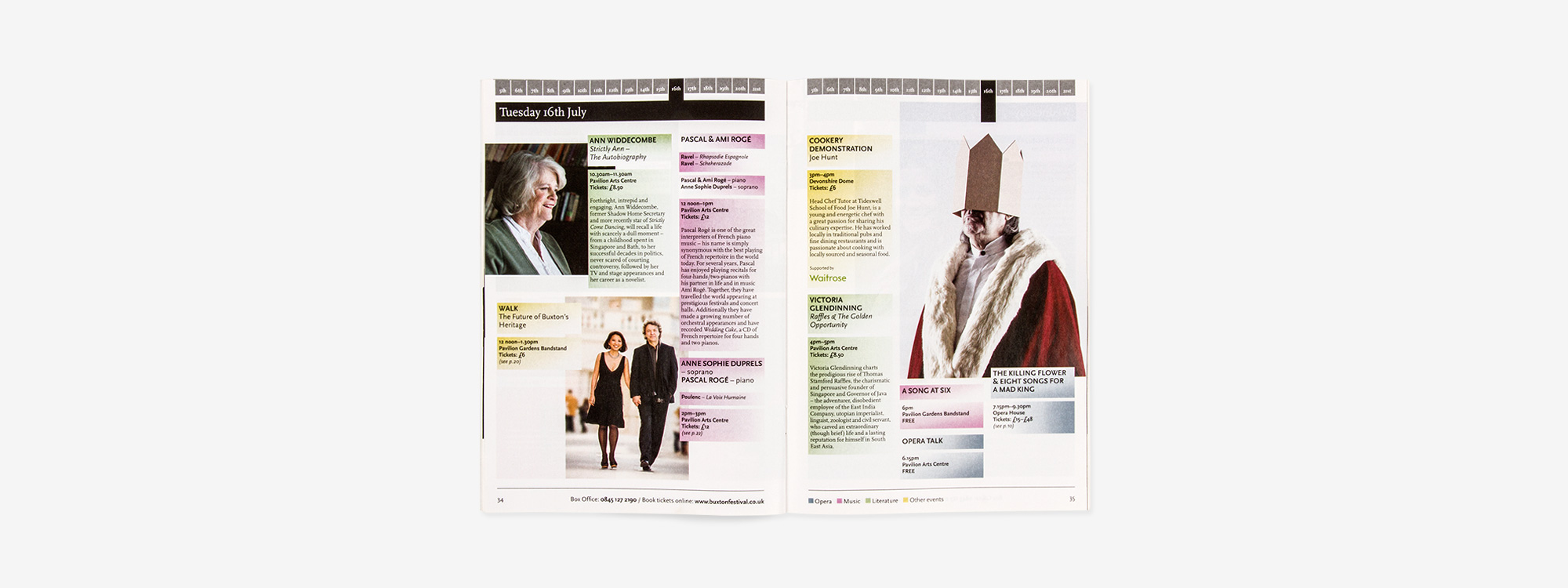
Programme
Brochure

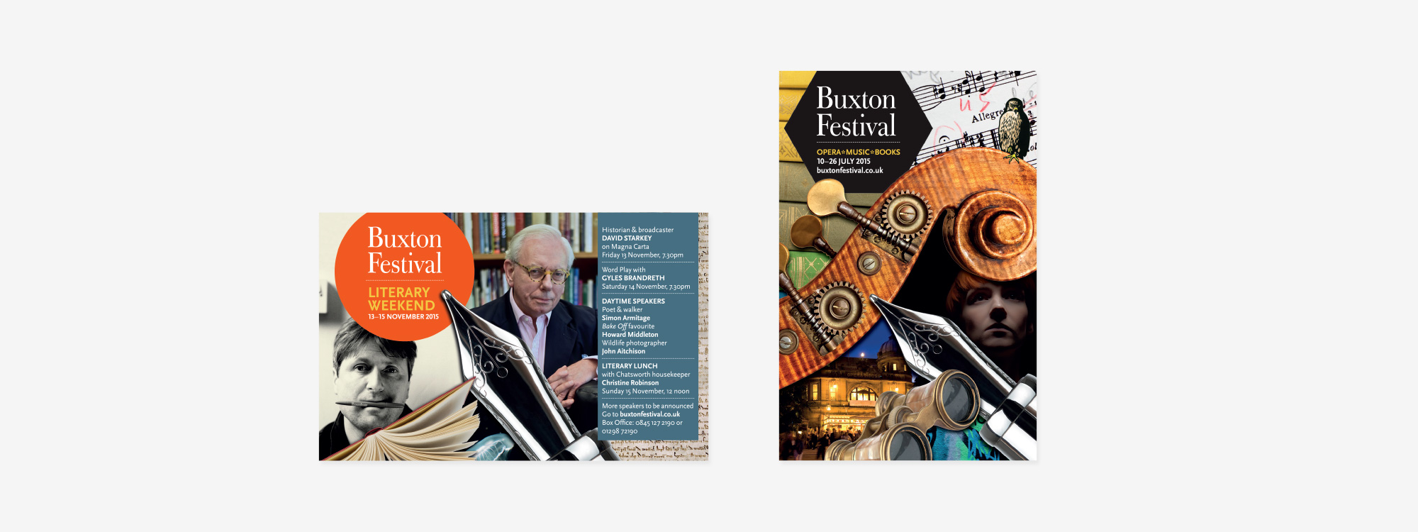
Advertisements
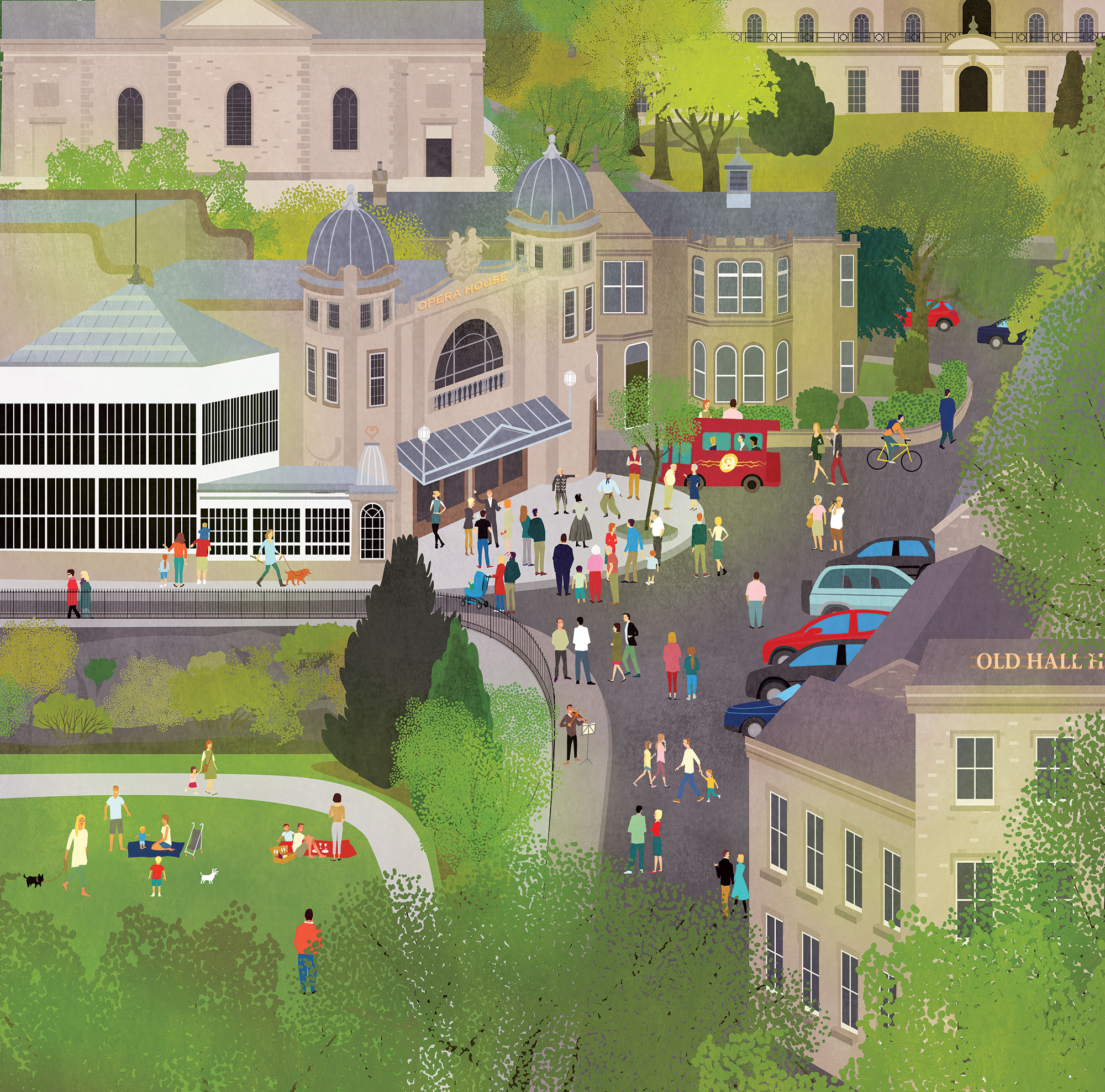
Illustration
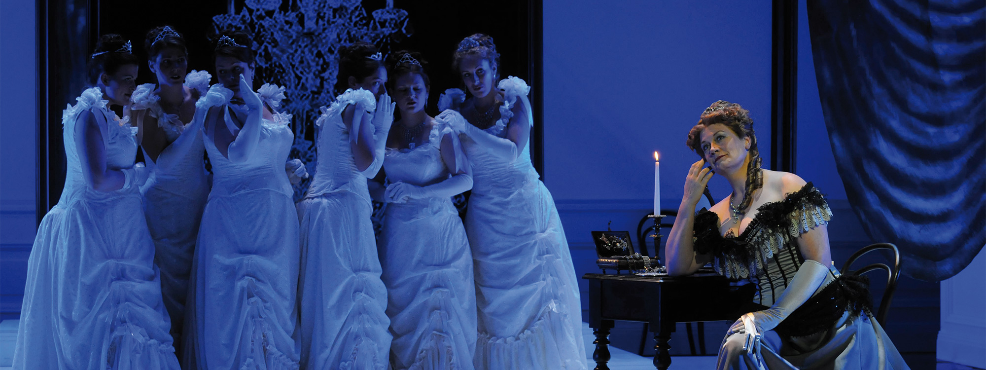
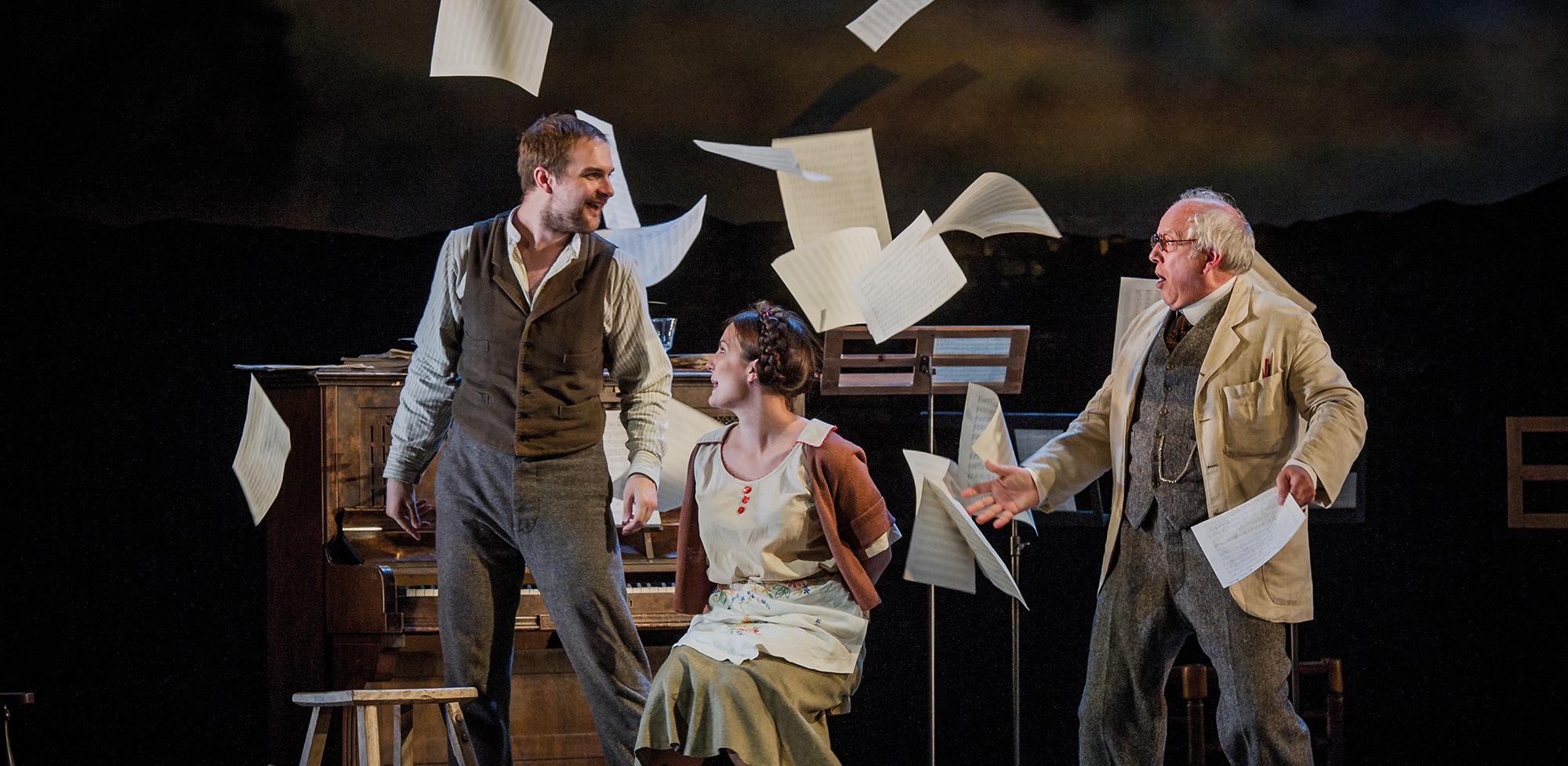
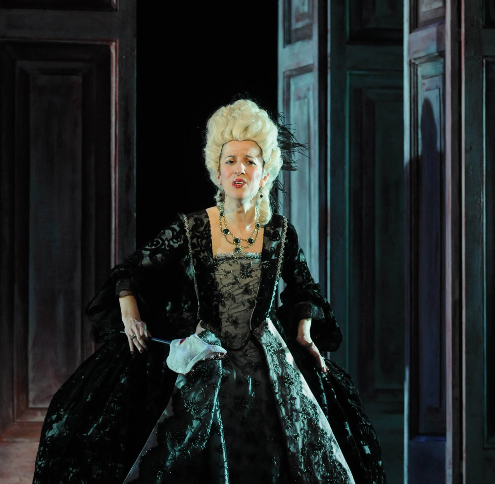
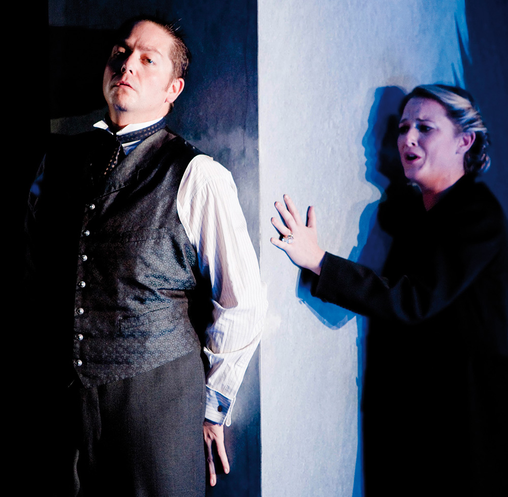
Buxton Operas
The Outcome
Following the rebrand and the production of redesigned marketing materials the Festival achieved record ticket sales for their literary series and an increase in sell outs for their opera and music events.
Interested in Glorious Thinking?
If you like what we did for the Buxton Festival rebrand maybe we could do something for you.
Mark Ross
Mailing List
Sign up to our mailing list to receive all the latest news.
Check out our privacy policy for the full story on how we protect & manage your submitted data.