
TATE Liverpool
How do you capture 100 years of art with a single image?
You create a colour-coded timeline that details every art movement over the past century.

The Brief
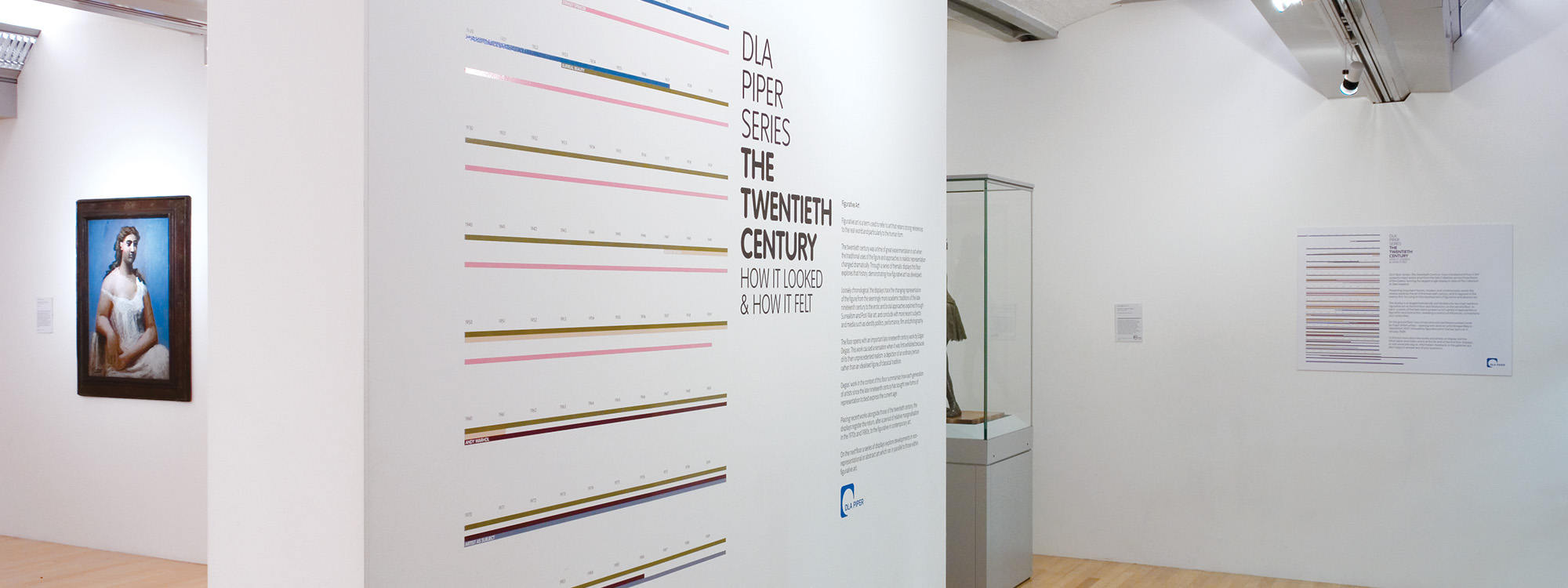
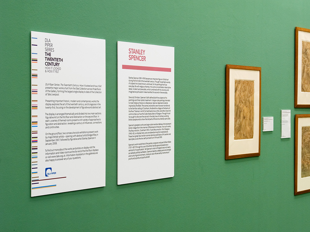
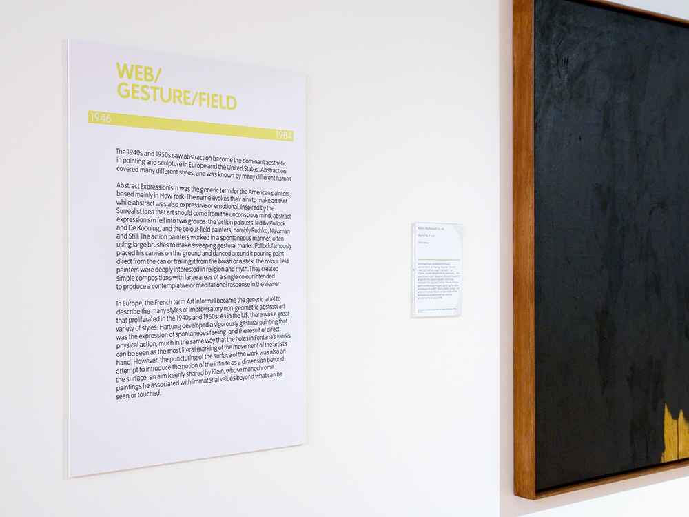
The TATE know a thing or two about art so we took it as an enormous compliment when we were asked to work on their biggest ever exhibition – The Twentieth Century How It Looked And How It Felt. The exhibition required a graphic theme communicating 100 years of art, whilst linking the exhibition space, which covered all three floors and the foyer of the Gallery.
Our Response
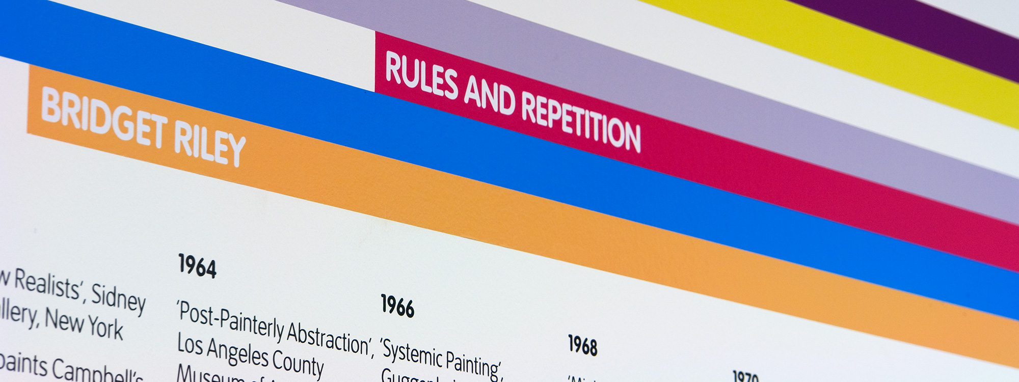
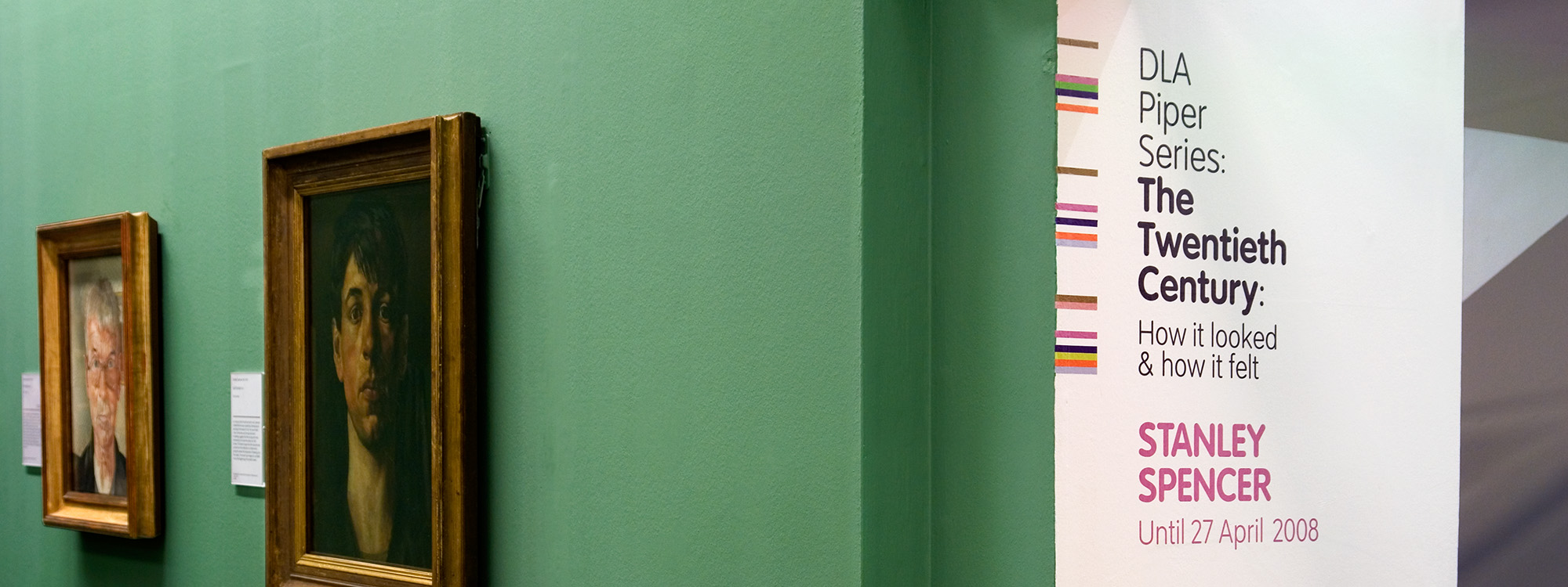
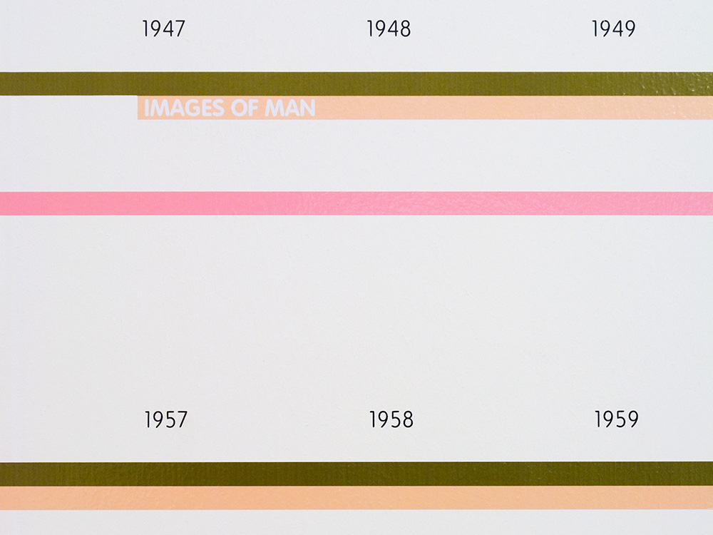
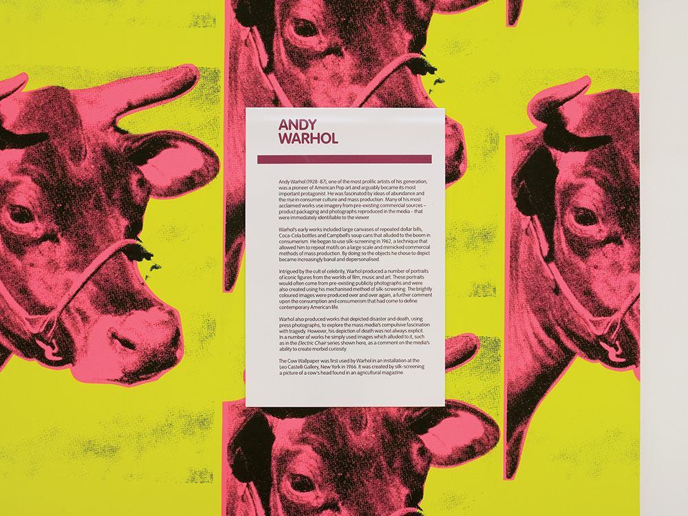
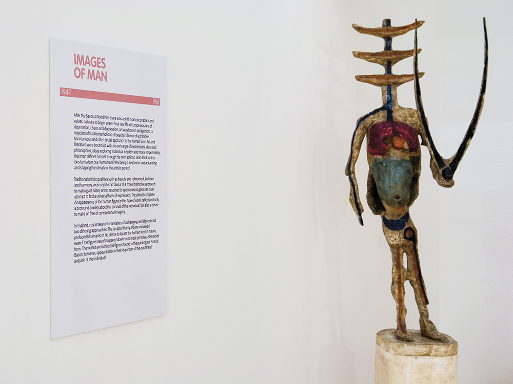
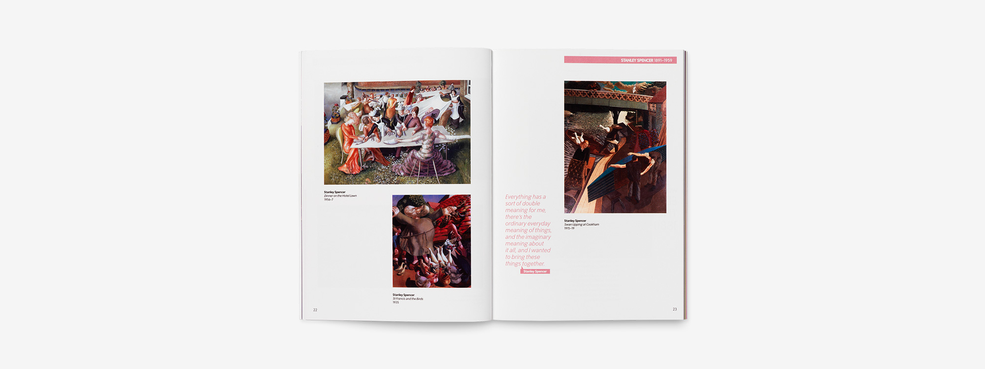
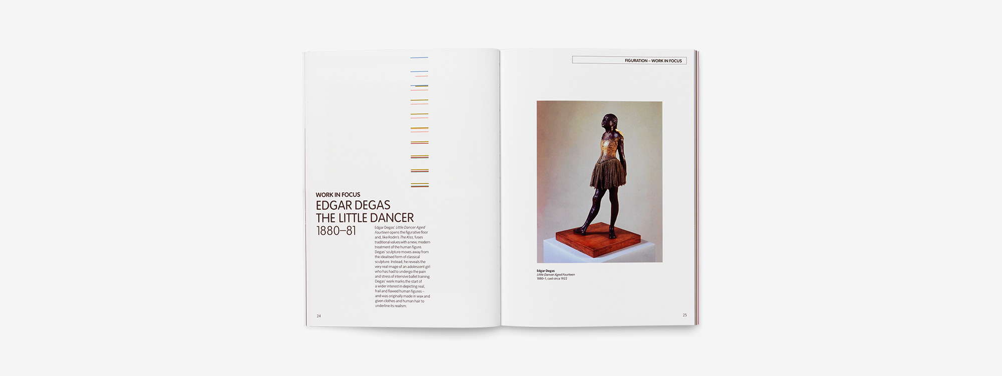
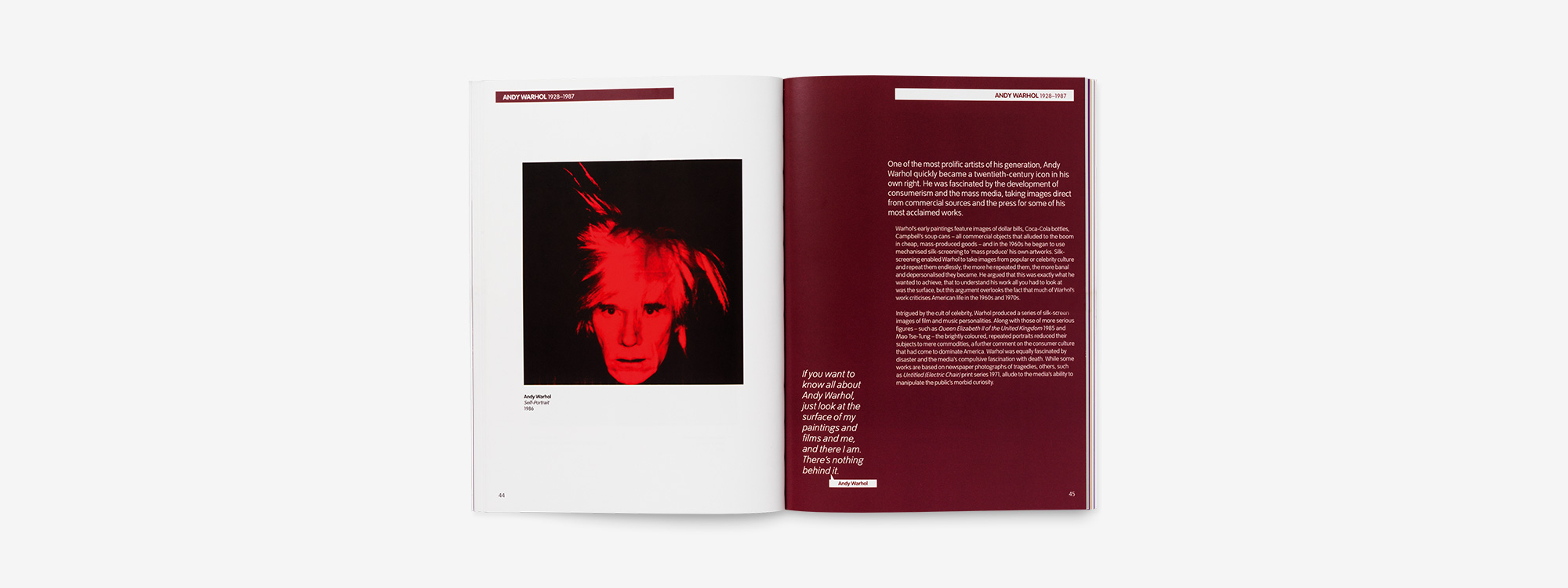
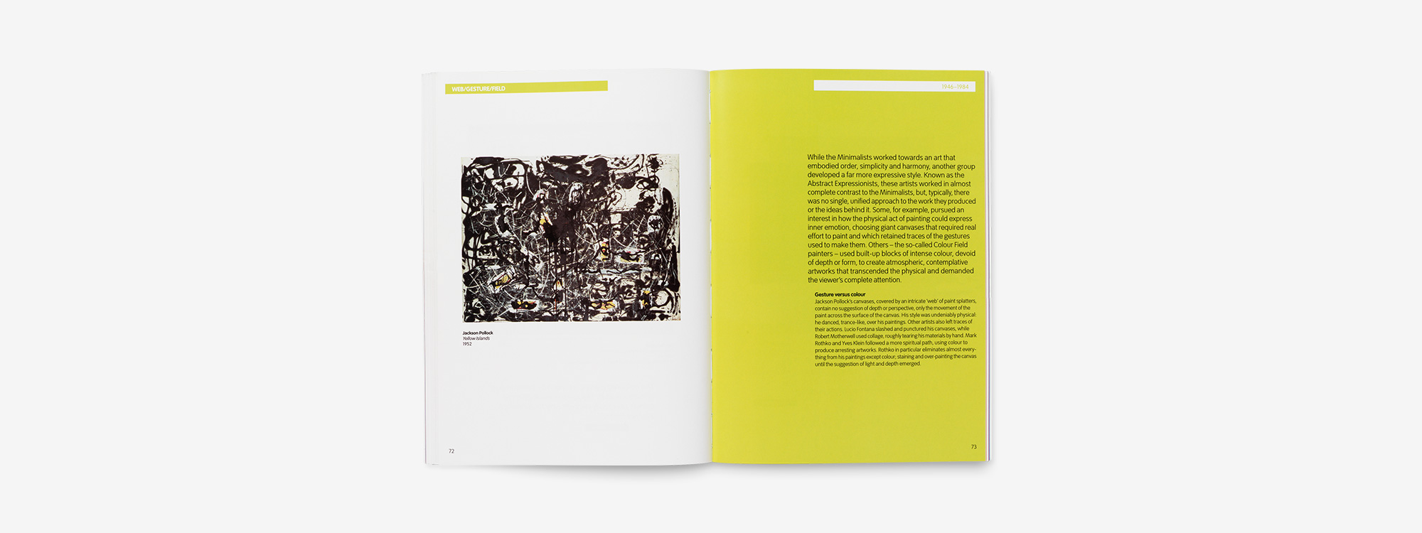
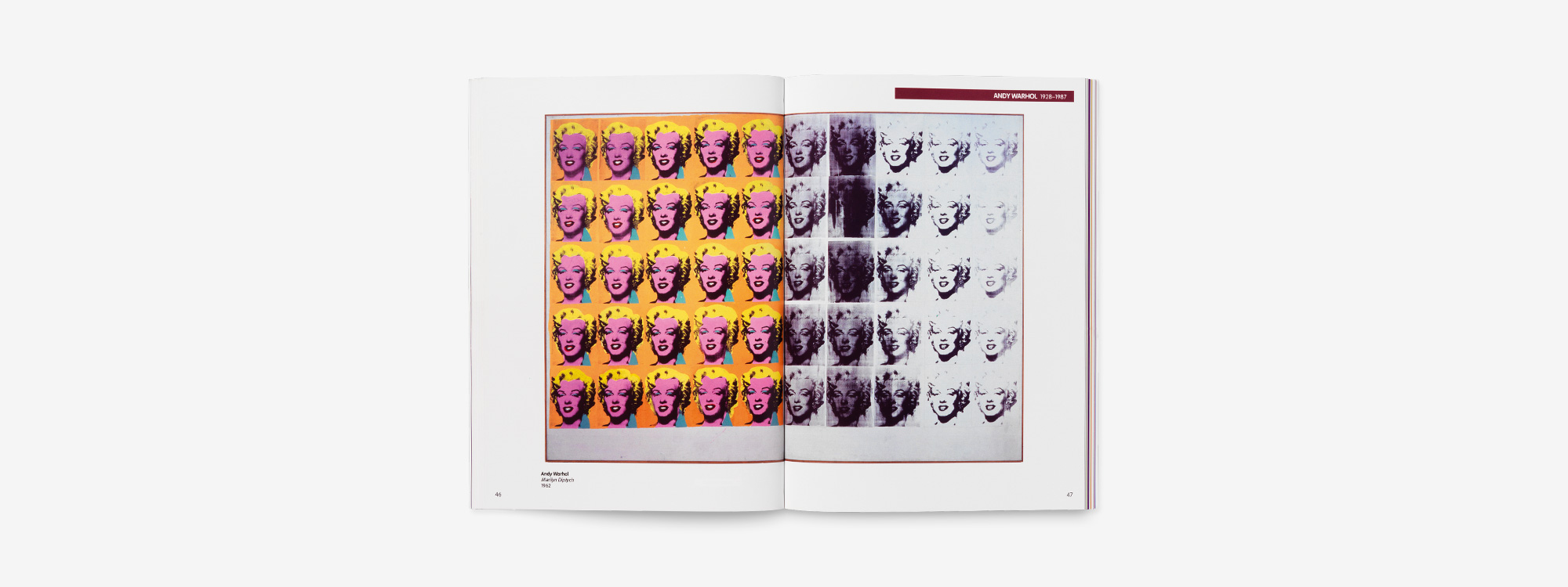
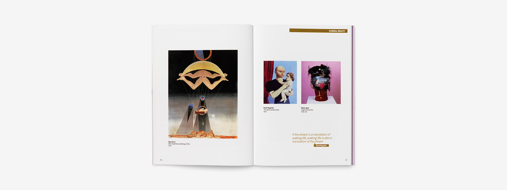
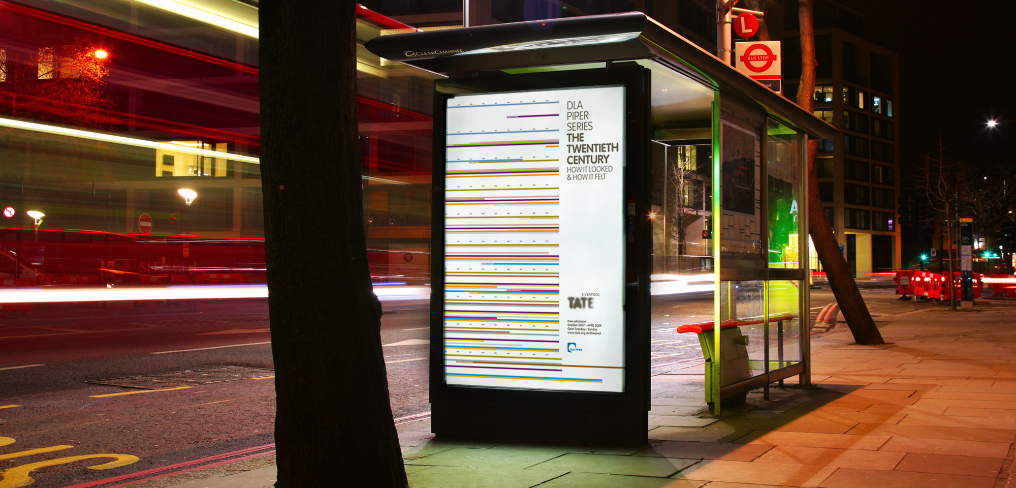
We created an identity based on a 100-year timeline, with colour-coding relating such artists as Rodin, Renoir, Degas, Picasso, Rothko and Warhol to their respective art movements. The concept also acted as a way-finding system to help visitors navigate their way around the exhibition.
Exhibition Space
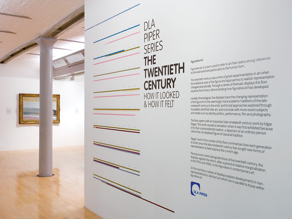
Wayfinding System
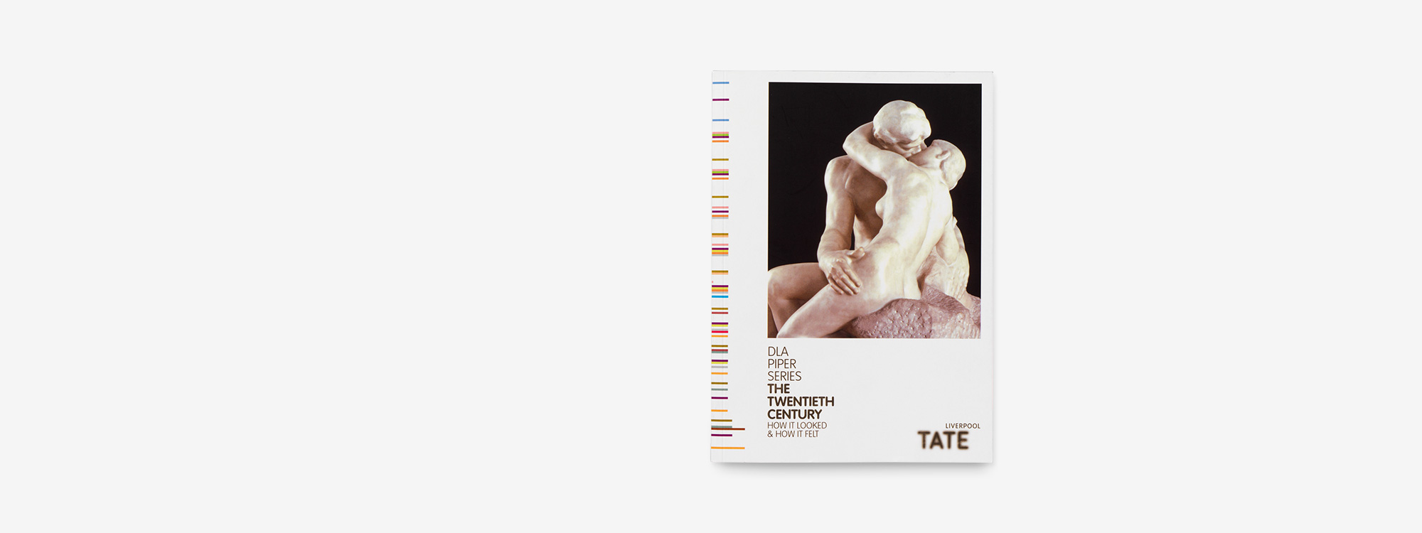
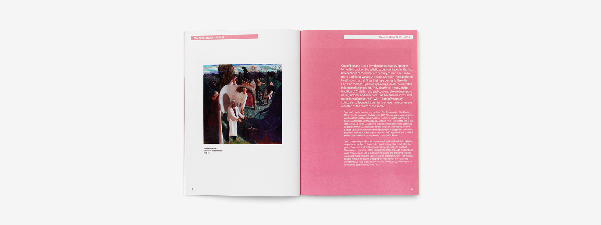
Commemorative Book
Advertising
The Outcome
Thankfully we did ourselves justice with visitor figures up 68% year on year, the need to reprint the 100 page exhibition catalogue to meet demand and a generous thank you from Christoph Grunenberg, Director of TATE Liverpool.
“Glorious captured the essence of TATE Liverpool’s major collection for the European Capital of Culture year, providing a striking and sensitive design. They came up with an inventive graphic solution that linked the different floors in a subtle but effective way. We lived with the results for over a year and it still looked fresh, enticing visitors in to enjoy the display.”
Communications and Publishing Manager,
TATE Liverpool
Interested in Glorious Thinking?
If you like what we did for the TATE Gallery in Liverpool, maybe we could do something for you.
Mark Ross

Mailing List
Sign up to our mailing list to receive all the latest news.
Check out our privacy policy for the full story on how we protect & manage your submitted data.