
Stanbridge Associates
Brand identity and print

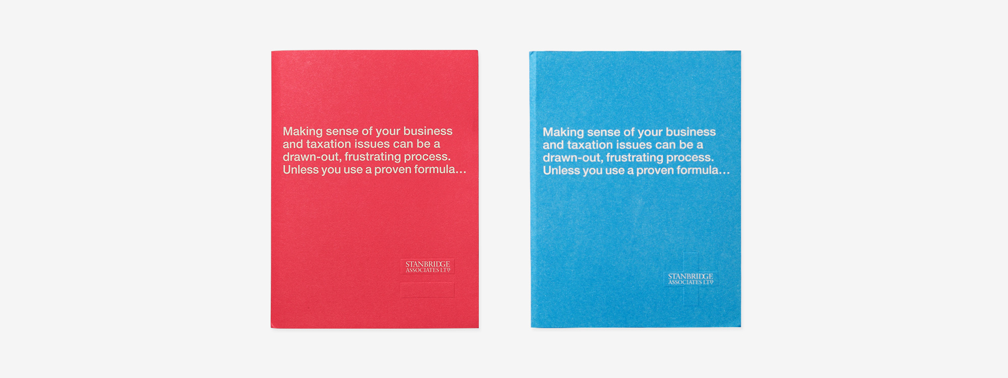
Stanbridge associates specialise in tax advice for high net earners in the legal and medical professions. Our brief was to create a new brand identity and promotional print. We took the initiative and produced two identities to target the two specific markets.

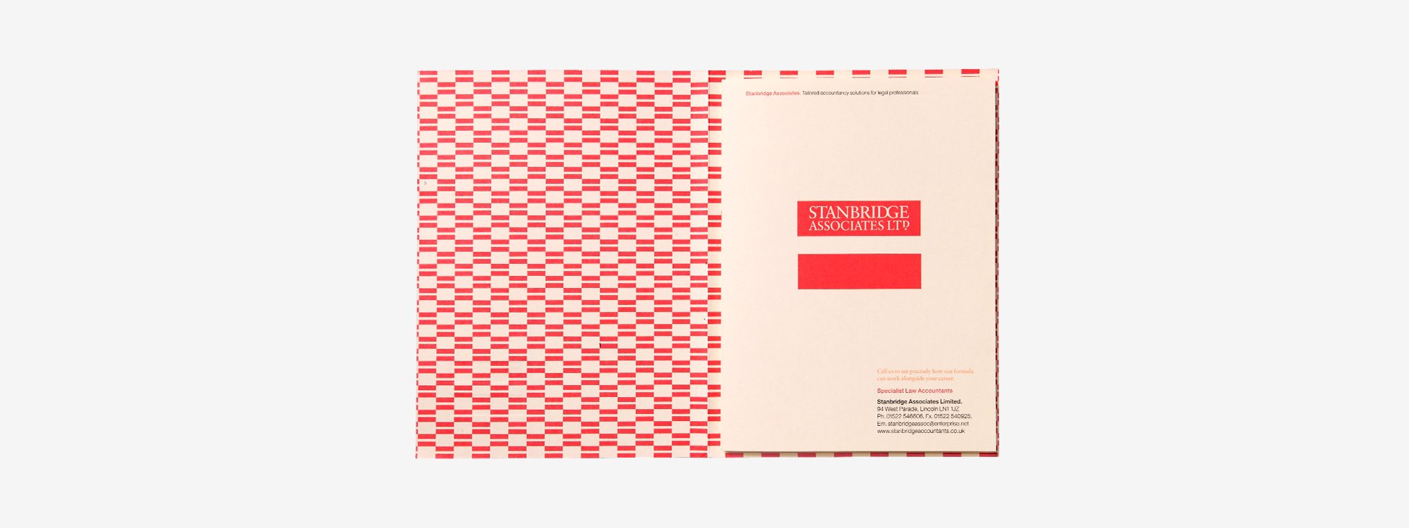
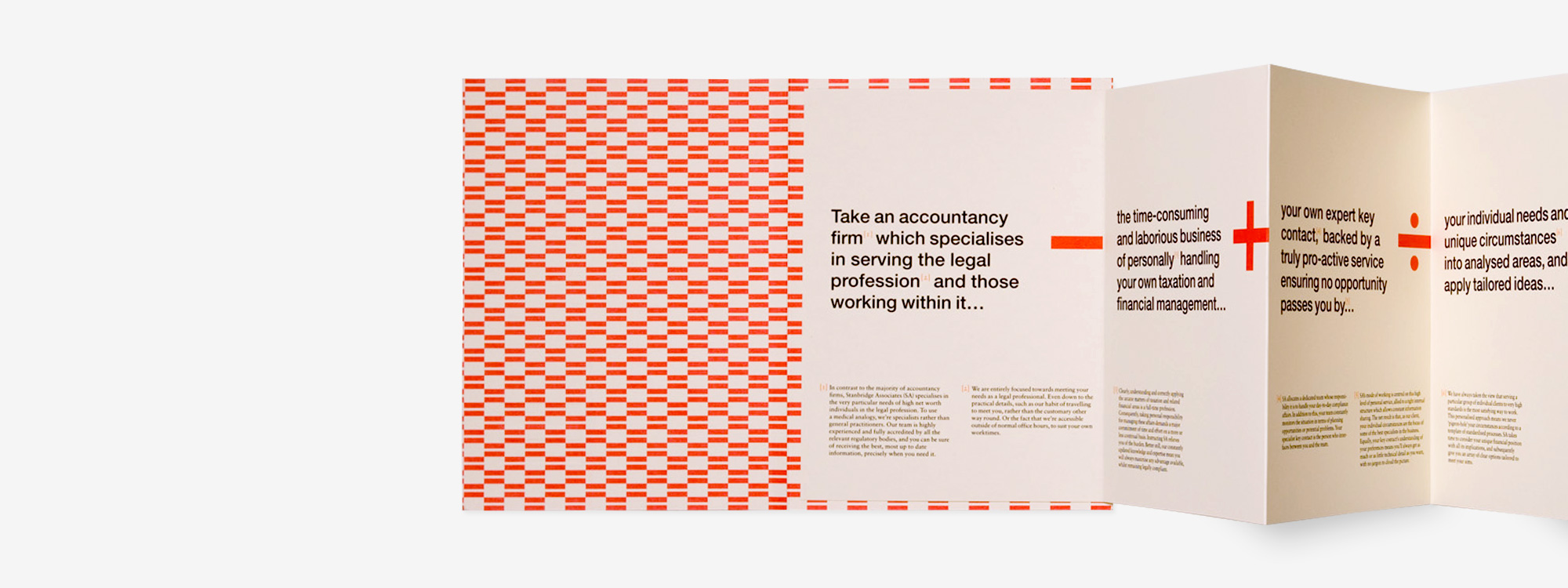
Brochure


Website

Mailing List
Sign up to our mailing list to receive all the latest news.
Check out our privacy policy for the full story on how we protect & manage your submitted data.