
Our Blog
Our thoughts and latest news.
-
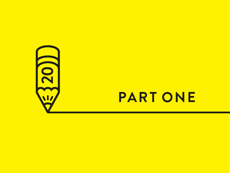
20 Glorious Lessons in Branding Learned over 20 Glorious Years: Part 1
Don't miss our top tips in branding learned over 20 Glorious years! Here's Part 1.
April 6, 2022 Dalia Jaffar
-
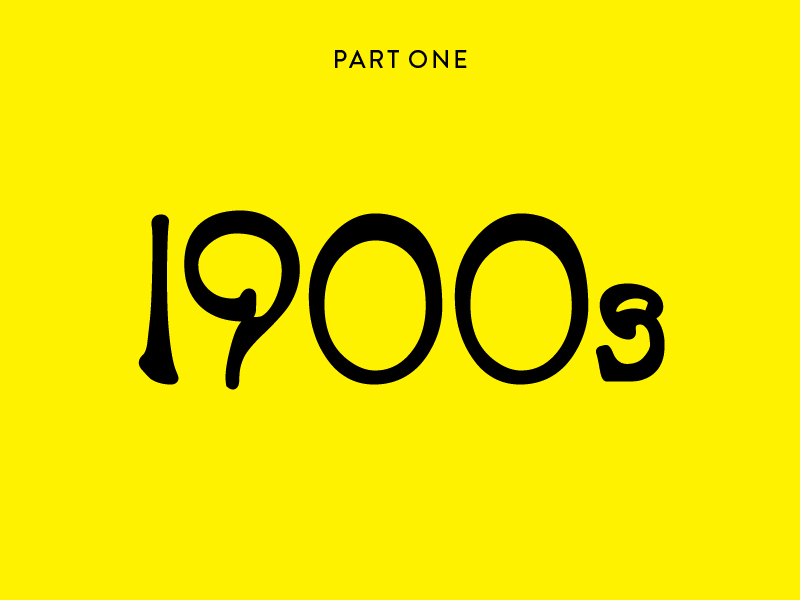
Branding through the decades: early 1900s and Art Nouveau
Enter the 1900s. Branding at the turn of the century and the dawn of a new era.
January 6, 2022 Dalia Jaffar
-
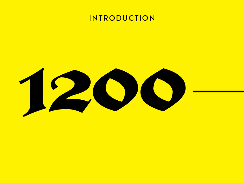
Branding through the decades: where it all began
If we asked you, what makes a brand, a brand? Where would you begin?
January 1, 2022 Dalia Jaffar
-
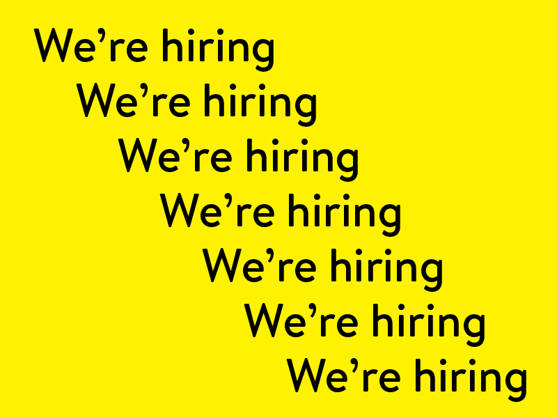
We’re Hiring – Junior Designer
Cat's out the bag. We're hiring!
June 17, 2021 Dalia Jaffar
-

Hexocene
Glorious shape a brand that shapes technology for the good of all. Ensuring it is safe, secure and beneficial to everyone.
May 4, 2021 Nick Plant
-
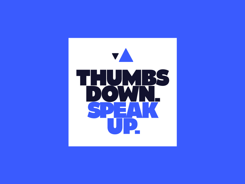
Thumbs Down. Speak Up.
Don’t just follow your kids on social media. Lead them.
May 4, 2021 Dalia Jaffar
-

Adding skills to your roll call without heads to your payroll: the benefits of agencies
Can using an agency add the right ingredients to really make your idea grow? Our latest blog plants the seed - we'll let you do the rest.
January 21, 2021 Dalia Jaffar
-

The unadulterated creativity of ideas: rediscovering the art in advertising
Churning out blogs, social posts, video content, automated ads and endless Instagram stories – all for the sake of contributing. But contributing to what & with what?
December 15, 2020 Dalia Jaffar
-
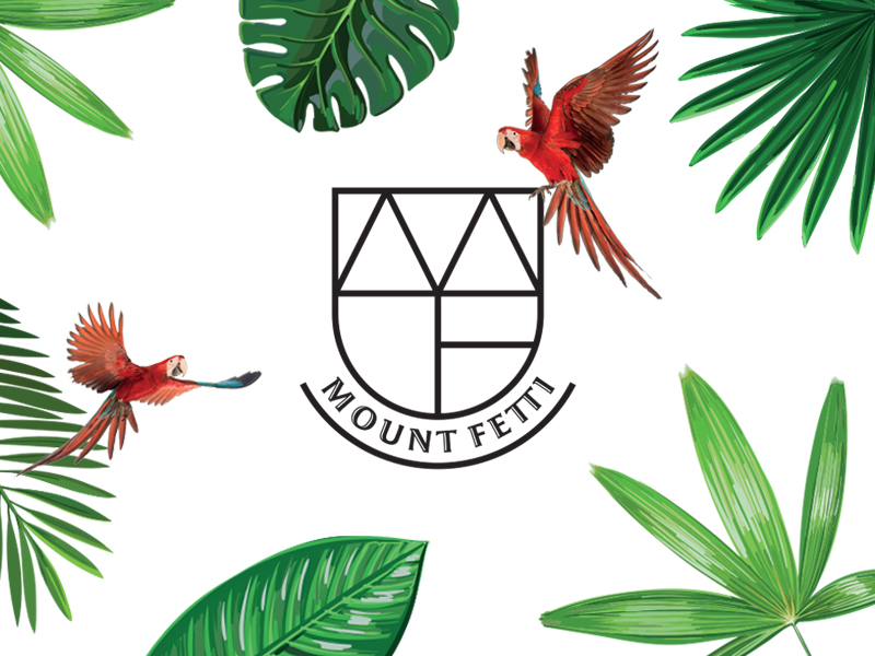
Navigating a different route: Mount Fetti and the safety rope of strong branding
At Glorious, we’ve seen first-hand how brand identity can provide the safety rope needed to navigate a path, that wasn’t part of the plan.
September 2, 2020 Dalia Jaffar
-

Living by the books
Our Senior Designer, Nick, shares his love of books and the stories behind some of the best known publishing company logos.
August 12, 2020 Nick Plant
-
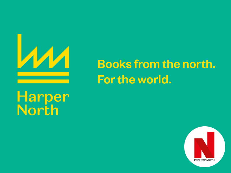
Prolific North: HarperCollins launches HarperNorth in Manchester
Glorious Creative brand HarperNorth, the new HarperCollins’ seeking voices from the north
August 10, 2020
-

Building Hector Real Estate Partners’ new site
Hector Real Estate Partners asked Glorious for a website that reflected their new, modern approach to the commercial real estate sector.
July 28, 2020 Nick Plant
Mailing List
Sign up to our mailing list to receive all the latest news.
Check out our privacy policy for the full story on how we protect & manage your submitted data.