
Our Blog
Our thoughts and latest news.
-

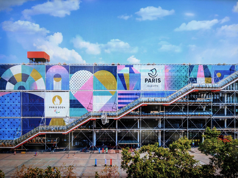
Around the world in 80 brands: Living the Luxe Life in France
Come along on our global branding adventure in 2024. Living the Luxe Life in France.
July 10, 2025 Dalia Jaffar
-

Around the world in 80 brands: Finding the Fun Down Under
Come along on our global branding adventure in 2025. Let's go down under.
January 7, 2025 Dalia Jaffar
-

Around the world in 80 brands: Searching for simplicity in Scandinavia
Come along on our global branding adventure in 2024.
November 16, 2024 Dalia Jaffar
-

Around the world in 80 brands: Trying Tropicalism in Brazil
We’re taking you on a global branding odyssey in 2024.
September 17, 2024 Dalia Jaffar
-

Around the world in 80 brands: Evoking La Dolce Vita in Italy
Our continual quest for branding inspiration is taking us global in 2024.
July 31, 2024 Dalia Jaffar
-

New series – Around the world in 80 brands: Making mascots in Japan
Great branding, like any artistic medium, is an amalgamation of influences and ideas.
May 31, 2024 Dalia Jaffar
-
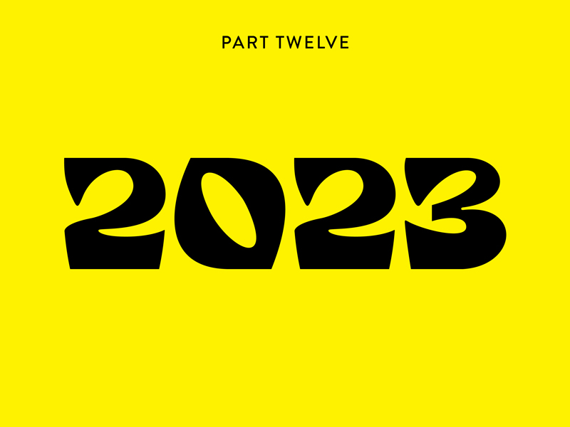
Branding through the decades: 2023
Over the last 12 months, our Branding through the Decades series has navigated the evolution of creative branding – unpicking how seismic social, political, and cultural events have shaped the way brands advertise.
June 13, 2023 Dalia Jaffar
-
How do major sporting organisations approach branding?
With a long list of major sporting events coming into view, we look at how organisations approach their branding.
June 6, 2023 Michael Peters
-
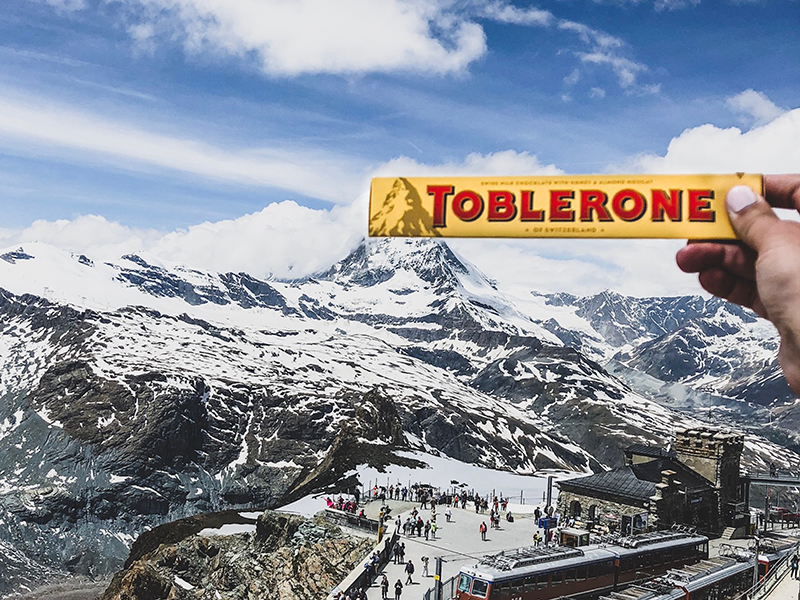
Toblerone forced to move mountains
Earlier this year a Swiss court ruled that Toblerone, that robust chocolate purchased almost exclusively it seems from airports, are no longer allowed to display the iconic Matterhorn mountain on its famous triangular packaging.
May 12, 2023 Nick Plant
-

Branding through the decades: enter the 2000s
Enter the 2000s. Turn of the millennia. An event so monumental, so unknown – that rumours were rife. Would digital clocks simply melt? Would machinery manage?
May 9, 2023 Dalia Jaffar
-

Branding through the decades: enter the 1990s
Enter the 1990s. It’s a pivotal decade, one that crosses a line from the archaic and into something we’d recognise more acutely like today’s world.
April 4, 2023 Dalia Jaffar
-

Finessing Flooring for Floorzy
When we were approached to brand a physical flooring business, we were eager to hit the ground running.
March 8, 2023 Nick Plant
Mailing List
Sign up to our mailing list to receive all the latest news.
Check out our privacy policy for the full story on how we protect & manage your submitted data.